

7 QC Tools for Process Improvement | PDF | Case Study
- What are 7 QC Tools?

→ 7 QC tools are systematic and scientific methods for problem-solving.
→ Also, they are used for product and process improvement.
→ They are used to solve almost 90% of shop floor problems very easily.
Table of Contents:
- History of 7 QC Tools
When to Use the Basic 7 QC Tools?
Why to use the 7 qc tools.
- The Basic 7 QC Tools For Process Improvement
- Cause and Effect Diagram (Fishbone or Ishikawa)
- Pareto Chart
- Scatter Diagram
- Control Chart
- Benefits of 7 QC Tools
- Limitations of 7 QC Tools
History of 7 QC Tools:
→ The Basic 7 Quality Control Tools originated after World War II in Japan.
→ Dr. Edwards Deming has played an important role in introducing statistical quality control methods.
→ He recommends the use of statistical methods to improve manufacturing quality.
→ After his work, Japanese industries have improved a lot in quality and processes in manufacturing.
→ Primarily Kaoru Ishikawa introduced the 7 QC Tools.
→ Dr. Kaoru Ishikawa was a professor at the engineering college at Tokyo University.
→ Ishikawa is known for the “Democratizing (Visual Aids/Symbols) Statistics” .
→ Good visual representation makes statistical and quality control more comprehensive.
→ The Basic 7 QC Tools gained popularity for their simplicity and effectiveness across the world.

→ The Basic 7 Quality Control Tools are necessary for problem-solving and process improvement.
→ Each tool has its own specific applications and benefits.
⏩ Refer to the below-mentioned key points when we can use 7 QC tools:
- For identifying potential causes of a problem
- Useful during brainstorming sessions
- When collecting data in a structured manner
- For monitoring process trends or patterns over time
- During the identification of the distribution of data
- Prioritization of defects, causes, efforts, etc
- Identify or validate the correlation between two variable
- Process flow documentation, analysis, and improvement
- A graphical technique that is easily understood by all
- Most helpful in troubleshooting quality-related issues
- They are fundamental tools for process and product quality improvement
- This facilitates the organization to resolve basic problems
- The 7 QC tools are easy to understand and implement
- They do not require complex analytics and statistical skills
- The basic 7 QC tools are simple yet powerful
- We can get an 80% result by applying 20% of the effort
The Basic 7 QC Tools For Process Improvement:
➝ Now we will understand the Basic 7 QC Tools in detail.
⏩ The 7 QC Tools are:
Note: We are considering the Flow Chart as a part of the 7 Basic QC Tools.
Also, you can consider stratification as a part of this tool.
(1) Flow Chart:
→ "Flow Chart is a diagrammatic representation that illustrates the sequence of operation to be performed to get the desired result."
→ It is a visual representation tool for a sequence of operations, therefore, we can easily illustrate the Internal and external operational boundaries.
→ A flow chart includes the steps involved in a process, the decision points, and the flow of control from one step to the next.
→ A flow chart is also called a "Process Flow Diagram."

⏩ Purpose of Flowcharts:
- Visualize Processes
- Identify Inefficiencies
- Standardize Procedures
⏩ Basic Elements of the Process Flow Diagram are:
⏩ Basic Symbols Used in Flowcharts:
- Parallelogram
⏩ Steps to Create a Flowchart:
- Define the Process
- Select Symbols
- Draw the Flowchart
- Review and Revise
⏩ Benefits of Using Flowcharts:
- Improvement
- Communication
⏩ Use Cases:
- Process mapping in manufacturing and service industries
- Identifying areas for quality improvement in workflows
- Documenting procedures for training and compliance
👉 Read our detailed article on Different Types of Flow Charts Explained with Examples
(2) Cause and Effect Diagram (Fishbone or Ishikawa):
→ "Cause and Effect Diagram is a meaningful relationship between an effect and its causes."
→ It guides concrete action and tracks the potential causes during an investigation of the effort to determine whether the item significantly contributes to the problem or not.
→ The cause and effect tool is a very popular root cause analysis tool.

⏩ The Different Names of Cause and Effect Diagram are:
- Ishikawa Diagram
- Fishbone Diagram
- Herringbone Diagrams
→ A fishbone diagram can identify all possible cause(s) for the problem.
→ In this tool, we can find possible causes with the help of the 6M concept those are man, machine, material, method, measurement, and mother nature.
→ Also, we can use this tool in marketing as 8P analysis and service industry as 4S analysis.
⏩ Steps to Create a Cause and Effect Diagram:
- Define the Problem
- Identify Main Categories
- Brainstorm Causes
- Analyze and Prioritize
⏩ Benefits of Using a Cause and Effect Diagram:
- Visual Representation
- Team Collaboration
- Problem-Solving
⏩ Use Cases of Cause and Effect Diagram:
- Quality improvement projects
- Problem-solving in manufacturing
- Analyzing service delivery issues
👉 Check our detailed article on Cause and Effect Diagram Explained with Case Study
(3) Check Sheet:
→ "Check Sheet is a well-structured data sheet that is used for collecting and analyzing data."
→ Data collected by the check sheet is used as input for the other tool and data can be collected based on asking a question by what, when, where, who, why, and how.
→ The purpose of a check sheet is to summarize the data and a tally count of event occurrences.
→ A check sheet counts the number of occurrences of an event, such as defects or non-conformance.
→ Hence the Check Sheet is also called a "tally sheet".
→ In many cases, a checklist will summarize countable data related to certain types of defects and will provide a rough graphical representation of wherein a part of the process, defects occurred.

⏩ Key Aspects of a Check Sheet:
- Structured Form
- Real-Time Data Collection
- Ease of Use
- Data Visualization
⏩ Uses of a Check Sheet:
- Defect Tracking
- Data Collection
- Process Improvement
- Quality Control
👉 Read our detailed article on Different Types of Check Sheets Explained with Example
(4) Histogram:
→ "Histogram is a type of bar graph representing the frequency distribution of the data."
→ Karl Pearson introduced the Histogram which is a bar graph representing the frequency distribution on every bar.
→ Histograms are used to show whether the output of our process matches the customer's requirements or not?
→ Also, we can make the decision based on the data patterns plotted on the Histogram.
→ With the help of the graph we can analyze whether the process is capable of meeting customer requirements or not?
→ A histogram is a pictorial representation of a set of data.

⏩ Key Aspects of a Histogram:
- Frequency Distribution
- Intervals (Bins)
⏩ Steps to Create a Histogram:
- Collect Data
- Determine the Range
- Choose Intervals (Bins)
- Count Frequencies
- Draw the Bars
- Interpret the Patterns
⏩ Uses of a Histogram:
- Understanding Data Distribution
- Identifying Patterns
⏩ Different Types of Histogram are:
- Normal Distribution
- Skewed Distribution
- Double-peaked or Bimodal
- Multipeaked or Multimodal
- Edge Peaked Histogram
- Truncated or Heart-cut histogram
👉 Also read a detailed article on Different Types of Histograms Explained with Case Study
(5) Pareto Chart:
→ "Pareto Chart is a bar graph arranged in descending order of height from left to right."
→ Pareto chart shows the order of the largest number of occurrences by item or by classes and the cumulative sum total.
→ The Pareto analysis helps us to prioritize where we can get more benefits by applying fewer efforts.
→ It is also very popular as a prioritization tool.
→ It communicates the principle of 80:20.
→ The Pareto Principle gives us information about the Vital few from Trivial many.
→ Hence, It is known as the "Vital few from Trivial many tool".
→ It states that 80% of an effect comes from 20% of the causes.

⏩ Key Aspects of a Pareto Chart:
- Cumulative Line
⏩ Steps to Create a Pareto Chart:
- Identify Problems/Causes
- Measure Frequency or Impact
- Calculate Cumulative Percentages
- Draw the Chart
⏩ Uses of a Pareto Chart:
- Prioritizing Problems
- Resource Allocation
👉 Read our detailed article on Pareto Chart Explained with Case Study
[6] Scatter Diagram:
→ "Scatter Diagram is used to study and identify the possible relationship between two variables."
→ It is used to identify and visualize the relationship between two variables.
→ Mostly the scatter diagram is used to validate the cause-and-effect relationships between two variables.
→ This tool helps in decision-making during the problem-solving process.
→ Also it helps to determine the correlation between two variables.
→ Scatter Diagram is the best validation tool.

⏩ Different names of the Scatter Diagram:
- Scatter Plot
- Scatter Graph
- Correlation Graph
- Scatter Gram
⏩ Key Aspects of a Scatter Diagram:
- Data Points
- Correlation
⏩ Steps to Create a Scatter Diagram:
- Identify Variables
- Plot Data Points
- Analyze the Pattern
⏩ Types of Correlation:
- Positive Correlation
- Negative Correlation
- No Correlation
⏩ Uses of a Scatter Diagram:
- Identifying Relationships
- Predicting Trends
👉 Also visit our detailed article on Scatter Diagram Explained with Example
[7] Control Chart:
→ "Control Charts are used for studying the process variation over time."
→ The control chart was invented by Walter A. Shewhart working for Bell Labs in the 1920s.
→ A control chart is also known as a Shewhart chart or process-behavior chart.
→ With the help of this tool, we can determine whether a manufacturing process or a business process is in control or not?
→ The control chart is a graph which is used to study process changes over time
→ Comparing the above tool this is the best forecasting tool.

⏩ Key Aspects of a Control Chart:
- Center Line (CL)
- Upper Control Limit (UCL)
- Lower Control Limit (LCL)
- Control Limits
⏩ Steps to Create a Control Chart:
- Calculate the Mean
- Calculate Control Limits
- Plot the Data
- Analyze the Chart
⏩ Types of Control Charts:
- X-bar Chart
⏩ Uses of a Control Chart:
- Monitoring Processes
- Identifying Variation
👉 Read our detailed article on Control Chart Explained with Case Study
Benefits of 7 QC Tools:
- Provides a structured approach for problem-solving
- Easy to understand
- Easy to implement
- A scientific and logical approach
- Improve the quality of products and services
- Identifying and analyzing problems
- Used for root cause analysis
- Enhance customer satisfaction
Limitations of 7 QC Tools:
- The accuracy of data collection depends on a person's skills
- Statistical interpretation requires highly skilled persons
- They are focused on identifying problems rather than preventing
- Reactive approach
- Focus on symptoms, not on root causes
Conclusion:
→ Seven QC tools are most helpful in troubleshooting issues related to quality
→ Different factors cause different effects on the process and make them unstable.
→ Those parameters cause variation in the process.
→ These tools are the most helpful for improving the process.
→ We can improve the efficiency and effectiveness of processes by using these tools.
Related Posts
23 comments.
very good presentation skill and to the point explaination

Thanks for your feedback and kind comment!!!
How to download???
You can check the individual articles!!!
Best in short... Great work Nikunj
Thank you very much for your kind comment!!!
Simply wonderful. Thanks very much!
this is a great initiative , well done
Thank you for your kind words!!!
Thanks and happy learning!!!
Nice teaching
Thank you and Happy Learning!!!
Great good initiative 👍 a How to Download
Thank you for your kind word!!
This is so helpful
Thanks for your feedback
HOW MAKE PARETO
You can go through with our article on pareto.
Sir can you please share process audit checklist
You can reach us at: [email protected]
Post a Comment
Contact form.
Lean Six Sigma Training Certification
- Facebook Instagram Twitter LinkedIn YouTube
- (877) 497-4462
The 7 Quality Control Tools: A Comprehensive Guide for Quality Excellence
July 8th, 2024
Quality proves pivotal for organizational endurance and success. Whether a seasoned quality guiding hand or a newcomer to the field, the 7 Quality Control tools stand as treasured companions to advance one’s abilities.
Esteemed quality pioneer Kaoru Ishikawa unveiled these 7 tools amid Japan’s post-war awakening, fashioning statistical quality principles accessible for all experiences and enabling company-wide effectiveness.
Graphical techniques help pinpoint, unravel, and solve quality matters, the 7 tools offer structured, evidence-guided approaches for problem-solving, process refinement, and decision-making.
Teams thus steer confidently by comprehension over assumption or intuition.
For quality stewards dedicated to performance-boosting and relationship-building through shared knowledge, these classic tools remain trusted aids.
This discussion explores each technique’s nuanced gifts, illuminating their staying power for continual optimization wherever quality matters most.
Key Highlights
- Understand the historical context and significance of the 7 quality control tools, and how they revolutionized Japan’s industrial resurgence after World War II.
- Cause-and-Effect Diagram ( Fishbone/Ishikawa Diagram )
- Check Sheets (Tally Sheets)
- Control Charts (Shewhart Charts)
- Pareto Charts
- Scatter Diagrams
- Stratification (Flowcharts/Run Charts)
- Learn best practices for creating, interpreting, and effectively using each of these tools, with step-by-step guidance and industry-proven techniques.
- Explore case studies and success stories that showcase the powerful impact of integrating the 7 quality control tools.
- Discover strategies for seamlessly incorporating these tools into your organization’s problem-solving and continuous improvement efforts, fostering a data-driven culture of excellence.
- Gain insights into the future of quality control tools in the digital age and how they can be adapted to meet the evolving needs of modern businesses.
Introduction to the 7 Quality Control Tools
Where quality is the cornerstone of success, the 7 quality control tools stand as indispensable allies for organizations seeking to achieve and sustain excellence.
These tools, collectively known as the 7 QC tools, are a set of graphical techniques designed to simplify the intricate concepts of statistical quality control, making them accessible to professionals across various industries and backgrounds.
Definition and overview of the 7 quality control tools
The 7 quality control tools encompass a comprehensive suite of techniques that empower organizations to identify, analyze, and solve quality-related issues with precision and efficiency.
Each tool serves a specific purpose, providing a structured and data-driven approach to problem-solving, process improvement , and decision-making, enabling teams to make informed choices based on evidence rather than guesswork or intuition.
Historical background and importance
The origins of the 7 quality control tools can be traced back to the post-war era in Japan, where the esteemed Kaoru Ishikawa, a pioneer in the field of quality management , recognized the need to simplify the complex concepts of statistical quality control.
During this pivotal period, Japanese organizations were focused on training their workforce in these advanced techniques but soon realized that the inherent complexity could intimidate and deter many workers from embracing these methodologies effectively.
Ishikawa’s visionary solution was to introduce the 7 quality control tools, which distilled the essence of statistical quality control into a set of user-friendly, graphical techniques.
Benefits of using the 7 quality control tools
The adoption of the 7 quality control tools offers numerous benefits to organizations committed to continuous improvement and customer satisfaction.
These tools facilitate:
Effective Problem-Solving: By providing a structured framework for identifying root causes , analyzing data, and visualizing relationships, the 7 QC tools equip teams with the necessary insights to address quality issues effectively.
Process Improvement: Through data-driven analysis and monitoring, these tools enable organizations to identify areas for improvement, streamline processes, and eliminate inefficiencies, ultimately enhancing productivity and reducing waste.
Data-driven Decision Making: The 7 quality control tools empower teams to base their decisions on objective data and statistical analysis, minimizing the risk of biases or unfounded assumptions, and leading to more informed and effective decision-making processes.
The 7 Quality Control Tools Explained
1. cause-and-effect diagram (fishbone diagram).

The Cause-and-Effect Diagram, also known as the Fishbone Diagram or Ishikawa Diagram , is a powerful tool designed to facilitate root cause analysis and identify potential causes contributing to a specific problem or effect.
Named after its creator, Kaoru Ishikawa, this diagram visually represents the relationship between an effect and its potential causes, resembling the skeletal structure of a fish.
The primary purpose of the Cause-and-Effect Diagram is to systematically explore and organize the various factors that could potentially contribute to a particular issue or outcome.
How to create and use a cause-and-effect diagram
Creating an effective Cause-and-Effect Diagram involves the following steps:
- Define the problem or effect: Clearly state the issue or outcome you wish to analyze, which will be represented as the “fish head” on the diagram.
- Identify the main cause categories: Determine the primary categories or broad areas that could potentially contribute to the problem, such as materials, methods, machinery, environment, or personnel. These categories will form the “bones” or main branches of the fishbone diagram .
- Brainstorm potential causes: For each main category, engage in a structured brainstorming session to identify specific potential causes or contributing factors. These sub-causes will be represented as smaller “bones” branching off from the main categories.
- Analyze and prioritize causes: Once all potential causes have been identified, analyze the diagram to determine which causes are most likely to be contributing to the problem. Prioritize these causes based on their perceived impact or likelihood of occurrence.
- Develop and implement countermeasures: Based on the prioritized causes, develop and implement targeted countermeasures or corrective actions to address the root causes and mitigate the problem effectively.
2. Check Sheets (Tally Sheets)

Check sheets, also known as tally sheets , are straightforward yet powerful tools designed to facilitate the systematic collection and organization of data related to quality issues, defects, or process performance.
These sheets serve as a structured means of recording and tabulating data, enabling organizations to identify patterns, trends, and areas for improvement.
The primary purpose of check sheets is to streamline the process of data collection and analysis, allowing teams to gather quantitative or qualitative information consistently and efficiently.
Types of check sheets
Check sheets can be categorized into three main types, each serving a specific purpose:
- Defect Location Check Sheets: These sheets are designed to record the location or specific area where a defect or issue occurred, providing valuable insights into potential problem areas or hotspots within a process.
- Tally Check Sheets: As the name implies, tally check sheets are used to record the frequency or occurrences of specific events, defects, or phenomena. These sheets typically feature a simple tally or check mark system, making it easy to quickly capture and quantify data.
- Defect Cause Check Sheets: These sheets are particularly useful for identifying and categorizing the potential causes or contributing factors associated with observed defects or issues. By capturing this information, organizations can gain valuable insights into the root causes underlying quality problems.
How to create and use check sheets
Creating and utilizing check sheets involves the following steps:
- Identify the data to be collected: Determine the specific information or metrics that need to be captured, such as defect types, locations, frequencies, or potential causes.
- Design the check sheet: Based on the identified data requirements, create a structured check sheet with appropriate columns or sections for recording the relevant information. Ensure that the sheet is user-friendly and easy to understand for those responsible for data collection.
- Train data collectors: Provide clear instructions and training to the individuals responsible for collecting data, ensuring they understand the purpose of the check sheet and the proper methods for recording information.
- Collect data: Implement the check sheet in the relevant areas or processes, and consistently record data as it becomes available or as events occur.
- Analyze and interpret data: Once sufficient data has been collected, analyze the check sheet for patterns, trends, or areas of concern. Use the information gathered to identify opportunities for improvement or further investigation.
3. Control Chart (Shewhart Chart)

Control charts, also known as Shewhart charts, are powerful statistical tools used for monitoring and analyzing process performance over time.
Named after Walter A. Shewhart, a pioneer in the field of statistical quality control, these charts are designed to help organizations determine whether a process is stable and predictable, or if it is subject to undesirable variations that require intervention.
The primary purpose of control charts is to enable organizations to practice statistical process control (SPC) , which involves monitoring and controlling a process to ensure that it operates within predetermined statistical limits.
Components of a control charts
A typical control chart consists of the following key components:
- Control Limits
- Center Line (Mean)
- Data Points
How to create and interpret control charts
Creating and interpreting control charts involves the following steps:
- Collect data: Gather relevant data on the process characteristic or quality metric you wish to monitor, ensuring that the data is representative and collected under stable conditions.
- Calculate control limits and center line: Using statistical methods (e.g., X-bar and R charts , individuals, and moving range charts ), calculate the upper and lower control limits, as well as the center line (mean) for the process characteristic.
- Plot data points: Plot the collected data points or subgroup averages on the control chart, positioning them relative to the control limits and center line.
- Interpret patterns and signals: Analyze the control chart for patterns or signals that indicate potential issues or variations in the process . Common signals include points outside the control limits , runs above or below the center line, or unusual patterns or trends.
- Investigate and take action: When signals or patterns indicate a potential issue, investigate the root causes and take appropriate corrective actions to bring the process back within control limits and ensure consistent performance.
4. Histogram

A histogram is a powerful data visualization tool that graphically represents the frequency distribution of a set of data.
It is a type of bar chart that displays the number of occurrences or observations within specific ranges or intervals, providing a clear visual representation of how data is distributed.
How to create and interpret histograms
Creating and interpreting histograms involves the following steps:
- Collect data: Gather the relevant data that you wish to analyze and visualize.
- Determine bin ranges: Divide the range of data into intervals or “bins” of equal width, ensuring that each data point falls into one of the defined bins.
- Calculate frequencies: Count the number of data points that fall into each bin, representing the frequency of occurrences within that range.
- Construct the histogram: Plot the bins on the horizontal axis and the corresponding frequencies on the vertical axis, creating a bar for each bin with a height proportional to its frequency.
- Analyze the distribution: Interpret the shape, center, and spread of the distribution by observing the patterns and characteristics displayed in the histogram, such as skewness, modality, and outliers.
5. Pareto Chart

The Pareto chart, named after the Italian economist Vilfredo Pareto, is a powerful tool that helps organizations prioritize issues or factors based on their relative importance or impact.
It is based on the Pareto principle, also known as the 80/20 rule , which suggests that a majority of consequences (typically around 80%) are often influenced by a minority of causes (approximately 20%).
How to create and interpret Pareto charts
Creating and interpreting Pareto charts involves the following steps:
- Collect data: Gather data on the various factors or issues you wish to analyze, such as defect types, causes of customer complaints, or sources of waste.
- Categorize and rank data: Categorize the data into logical groups or factors, and rank them in descending order based on their frequency, impact, or importance.
- Construct the Pareto chart: On the left vertical axis, plot the frequency or impact of each factor using bars, arranged in descending order from left to right. On the right vertical axis, plot the cumulative percentage represented by a line graph.
- Identify the “vital few”: Analyze the chart to identify the factors or issues that contribute to a significant portion of the overall problem or outcome, typically around 80% or more. These are considered the “vital few” that should be prioritized.
- Prioritize and take action: Based on the identified vital few factors, prioritize and implement targeted improvement efforts or corrective actions to address the most significant contributors to the problem.
6. Scatter Diagram

A scatter diagram, also known as a scatter plot, is a graphical tool used to analyze and visualize the relationship between two variables.
It plots pairs of numerical data, with one variable represented on the horizontal (x) axis and the other variable on the vertical (y) axis, forming a collection of data points.
The primary purpose of a scatter diagram is to identify and understand the nature and strength of the relationship between two variables.
How to create and interpret scatter diagrams
Creating and interpreting scatter diagrams involves the following steps:
- Identify variables: Select the two variables you wish to analyze for potential relationships, typically an independent variable (x-axis) and a dependent variable (y-axis).
- Collect data: Gather pairs of data points representing the values of the two variables.
- Plot data points: On a coordinate plane, plot each pair of data points by representing the independent variable’s value on the x-axis and the dependent variable’s value on the y-axis.
- Positive correlation: Data points form an upward-sloping pattern, indicating that as one variable increases, the other tends to increase as well.
- Negative correlation: Data points form a downward-sloping pattern, indicating that as one variable increases, the other tends to decrease.
- No correlation: Data points are randomly scattered, indicating no apparent relationship between the variables.
7. Stratification (Flowchart, Run Chart)

Stratification, also known as a flowchart or run chart , is a quality control tool used to categorize and visually represent data or process steps in a structured manner.
It involves dividing or grouping data into distinct categories or strata based on specific characteristics or factors, enabling organizations to identify patterns, trends, or potential areas for improvement within each stratum.
The primary purpose of stratification is to enhance process understanding by revealing insights that may be obscured when data is analyzed as a whole.
How to create and use stratification
Creating and using stratification involves the following steps:
- Identify stratification factors: Determine the factors or characteristics that will be used to categorize the data, such as product type, manufacturing shift, supplier, or geographic region.
- Collect and categorize data: Gather relevant data and categorize it based on the identified stratification factors, ensuring that each data point is assigned to the appropriate stratum or category.
- Construct the stratification diagram: Visually represent the categorized data using a flowchart, run chart , or other suitable graphical representation, clearly distinguishing the different strata or categories.
- Analyze within strata: Examine the data within each stratum or category, looking for patterns, trends, or variations that may be specific to that particular group or factor.
- Compare across strata: Compare the patterns and trends observed across different strata to identify potential sources of variation or areas where improvements can be made.
- Implement targeted improvements: Based on the insights gained from the stratification analysis, develop and implement targeted improvement efforts or corrective actions tailored to specific strata or factors.
Integrating the 7 Quality Control Tools
While each of the 7 quality control tools serves a specific purpose, their true power lies in their integrated use for comprehensive problem-solving and process improvement efforts.
By combining the strengths of these tools, organizations can gain a holistic understanding of quality issues, identify root causes , and develop effective solutions.
By integrating the 7 quality control tools into a cohesive problem-solving framework, organizations can leverage their collective power, ensuring a comprehensive and data-driven approach to continuous improvement and quality excellence.
Incorporating the tools into quality management methodologies
The 7 quality control tools have become indispensable components of various quality management methodologies and frameworks, such as Lean, Six Sigma , and Total Quality Management (TQM) .
These methodologies provide structured approaches to quality improvement, and the 7 QC tools serve as essential techniques for data collection, analysis, and decision-making within these frameworks.
For instance, in the Six Sigma methodology, the 7 quality control tools are commonly used throughout the DMAIC (Define, Measure, Analyze, Improve, Control) cycle:
- Define: Flowcharts and cause-and-effect diagrams can be used to define the problem and identify potential root causes.
- Measure: Check sheets and stratification can be employed to collect and categorize data for analysis.
- Analyze: Histograms, Pareto charts, and scatter diagrams can provide insights into process performance, prioritize issues, and identify relationships between variables.
- Improve: Based on the analysis, targeted improvements can be implemented using the insights gained from the various tools.
- Control: Control charts can be used to monitor process performance and ensure sustained improvements.
These 7 quality control tools / companions emerge as invaluable allies across industries.
Born from Kaoru Ishikawa’s pioneering perceptiveness, they prove themselves repeatedly – empowering problem exposure, unraveling, and solving with sureness and efficiency.
Their true gift lies in simplicity and reach. Distilling statistical quality’s complexities insightfully, these graphical friends democratize quality’s pursuit, including diverse talents in continuous progress coordination.
Individual tools interconnect, a toolkit illuminating root causes, prioritizing concerns, and implementing targeted remedies.
Their integration further strengthens quality systems like Lean, Six Sigma , and Total Quality Management .
Whether a guiding veteran, up-and-coming practitioner, or business leader invested in operational excellence , embrace these seven gifts.
Foster opportunity and culture for constantly honing comprehension. Weave their methods wherever quality presides.
Steered thus, organizations stay on course addressing today’s and tomorrow’s challenges, and leadership in quality for decades ahead.
May shared insights propel all committed to thoughtful cooperation, service improvement and relationships uplifted through challenges met together.
SixSigma.us offers both Live Virtual classes as well as Online Self-Paced training. Most option includes access to the same great Master Black Belt instructors that teach our World Class in-person sessions. Sign-up today!
Virtual Classroom Training Programs Self-Paced Online Training Programs
SixSigma.us Accreditation & Affiliations

Monthly Management Tips
- Be the first one to receive the latest updates and information from 6Sigma
- Get curated resources from industry-experts
- Gain an edge with complete guides and other exclusive materials
- Become a part of one of the largest Six Sigma community
- Unlock your path to become a Six Sigma professional
" * " indicates required fields

Streamlining Six Sigma Projects with The 7 QC Tools
Updated: September 26, 2023 by Ken Feldman
As in any tool chest, you can have dozens, if not hundreds, of different tools for all types of specialized tasks. Such is the case with Six Sigma. There are many tools available for your use depending on what you want to accomplish. However, like your home tool chest, there are a small set of basic tools that are your go-to tools you will use most often and on most projects.
Let’s review the 7 QC tools that are most commonly used in Six Sigma , the benefits of those tools, and some best practices for using them.
Overview: What are the 7 QC tools?
It is believed that the 7 QC tools were introduced by Kaoru Ishikawa in postwar Japan, inspired by the seven famous weapons of Benkei. Benkei was a Japanese warrior monk who armed himself with seven weapons and was on a personal quest to take 1,000 swords from samurai warriors who he believed were arrogant and unworthy.
Ishikawa was influenced by a series of lectures on statistical quality control given by Dr. W. Edwards Deming in 1950 to a group of Japanese scientists and engineers. Unfortunately, the complexity of the subject intimidated most workers, so Ishikawa focused primarily on a reduced set of tools that would suffice for most quality-related issues.
The 7 QC tools are:
- Check sheet
- Fishbone diagram (cause and effect diagram, or Ishikawa diagram)
- Pareto chart
- Control chart
- Scatter diagram
- Stratification
Let’s explore each in a little more detail.
Check sheet: A form to collect and tally data for further analysis.
Image source: techqualitypedia.com .
Fishbone diagram: Fishbone diagrams are used to drill down to find the root cause of a problem. As the name implies, the diagram looks like the bones of a fish, where each main bone represents a specific category of possible root cause, and the subsequent drilling down is shown as smaller and smaller bones.
Image source: asq.org .
Histogram: This is a bar graph showing the frequency of a set of data, usually continuous data. The histogram allows you to see the center of the data, the range of the data, and the distribution of the data. It is a very useful snapshot. The downside is that you can’t see the sequence or order of the data.
Image source: statisticsbyjim.com .
Pareto chart: This chart is based on the 80/20 principle that says 80% of your effect is caused by 20% of your causes. For example, 80% of your sales comes from 20% of your customers. Dr. Joseph Juran, who developed this chart, often referred to this principle as the vital few and trivial many . He later revised that to the vital few and useful many . The Pareto chart lists the causes in descending order of frequency or magnitude. It is used to prioritize what you should look at first to improve your process.
Image source: www.automateexcel.com .
Control chart: A control chart is a statistical tool that looks at your process data over time for the purpose of distinguishing between special cause and common cause variation.
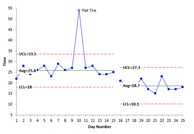
Image source: www.spcforexcel.com .
Scatter diagram: These are also known as scatter plots. They’re used to show a graphical correlation between a set of paired data on an X and Y axis. It is the graphical representation of what you would use for regression analysis.
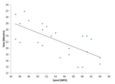
Image source: www.spcforexcel.com .
Stratification: This is a graph that shows data that has been stratified when the data comes from different sources. It is useful to view the data by certain strata such as shift, gender, geographic location, machines, or suppliers.
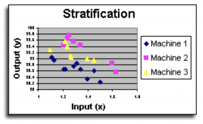
Image source: www.systems2win.com .
3 benefits of the 7 QC tools
These seven tools are easy to understand and apply and will help you understand what is going on in your process.
1. Easy
These 7 QC tools are easy to understand and implement yet powerful in identifying root causes, in discriminating between types of variation, and as a visual description of your data. A picture is truly worth 10,000 words (or statistical calculations).
2. Software-driven
Gone are the days when you had to draw all of your graphs by hand. There are many simple and cost-effective software packages that will take your data and quickly produce graphs.
3. 80/20
The Pareto principle applies to the 7 QC tools as well. 80% of your quality issues can be addressed by using 20% of the most common tools.
Why are the 7 QC tools important to understand?
The key thing to understand is when to use each tool — which one is appropriate for your specific situation?
Tools address different issues
The more familiar you are with these common tools, the quicker you’ll be able to select the right one to help you solve your problem or answer your question. The Fishbone diagram is used to search for root causes of your problem. A control chart is used to distinguish between common and special cause variation. A scatter diagram is used to look for correlation or relationship between an X and Y variable.
Graphs don’t tell the whole story
Graphs and diagrams are useful for providing an overview and directional indicator of your process, but statistical analysis will provide greater confidence than a graph alone.
Flexibility
These seven tools can be used for different types of data and across any type of function. Their flexibility makes them useful in myriad situations and industries, so becoming familiar with them can be a wise investment.
3 best practices when thinking about the 7 QC tools
Use these tools for as many applications as is feasible. Keep it simple, and only use the more sophisticated and complex tools if you need the additional information and analysis.
1. Have a clear idea of what question you’re trying to answer
Since each of the tools can be used to answer different data and process questions, be sure you’ve clearly defined the question you’re trying to answer.
2. Use them as your primary presentation
Use the 7 QC tools and their accompanying graphs and diagrams as your primary presentation format. Reserve the statistical analysis for questions that go beyond what’s answered in the graphs.
3. Make sure they’re self-explanatory
Be sure your graphs are succinct and self-explanatory so people can understand what you’re trying to tell them without the need for a long-winded explanation.
Frequently Asked Questions (FAQ) about the 7 QC tools
What is meant by stratification .
If you collected production data throughout the day across all three shifts and five machines, you might want to stratify or separate your data and look at it by shift and by machine. This would allow you to understand whether there were any differences between the strata. This might indicate the source of a root cause or an opportunity to improve the other shifts if one is found to be doing better than the others.
What are the 7 basic QC tools?
Scatter diagrams, Pareto charts, control charts, histograms, stratification, fishbone diagrams and check sheets.
Do I have to draw the graphs and diagrams for the 7 QC tools by hand?
With the use of current software and computer technology, you will rarely be required to create the graphs by hand. Still, it might be interesting to do it by hand once to fully appreciate the tools and software available to us.
Let’s review what’s in your tool belt
The 7 QC tools are basic graphical representations of your data. They can be used to answer a wide variety of questions about your data and your process. Use them as your primary presentation format when talking about what your data is telling you. While they are not a complete list of tools, they should be robust enough to address many of your improvement issues.
The 7 QC tools, while basic, are foundational to the Six Sigma methodology and have stood the test of time. Their simplicity and versatility make them indispensable for professionals across industries. As businesses evolve and data becomes more integral to decision-making, the importance of these tools only grows. They bridge the gap between raw data and actionable insights, allowing teams to make informed decisions. Moreover, in today’s digital age, with the integration of AI and machine learning, these tools can be further enhanced to provide even deeper insights. However, the essence remains the same: understanding and improving processes through data visualization.
Key Points About The 7 QC Tools:
Origin and Influence: Introduced by Kaoru Ishikawa, inspired by Benkei’s seven weapons and influenced by Dr. W. Edwards Deming’s lectures on statistical quality control.
List of 7 QC Tools: Check sheet, Fishbone diagram, Histogram, Pareto chart, Control chart, Scatter diagram, and Stratification.
Benefits: These tools are easy to understand, software-driven, and adhere to the 80/20 principle, addressing 80% of quality issues with 20% of the most common tools.
Importance: They address different issues, provide an overview of processes, and offer flexibility across data types and functions.
Best Practices: Clearly define the question, use the tools as the primary presentation format, and ensure graphs are self-explanatory.
About the Author

Ken Feldman
7 QC Tools | 7 Quality Tools | Process Improvement Tools
7 QC Tools are also known as Seven Basic Quality Tools and Quality Management Tools. These graphical and statistical tools are used to analyze and solve work-related problems effectively.
The 7 Quality Tools are widely applied by many industries for product and process improvements, and to solve critical quality problems.
7QC tools are extensively used in various Problem Solving Techniques which are listed below:
- 8D Problem Solving Methodology.
- PDCA Deming Cycle for Continuous improvement in product and processes.
- Lean Manufacturing for 3M Waste elimination from processes.
- Various phases of Six Sigma-DMAIC to reduce process variations .

Table of Contents
WHAT ARE 7 QC TOOLS?
The 7 quality tools are simple graphical and statistical tools but very powerful in solving quality problems and process improvement.
These statistical tools are very easy to understand and can be implemented without any complex analytical competence or skills.
The 7 tools of quality are generally used by quality control and quality assurance engineers to solve product or process-related quality issues on a daily/weekly/monthly basis and to reduce/eliminate non-value-added activities like product rework, repair, and rejection.
7 QC Tools List | Quality Tools
The list of 7 QC tools are:
Check Sheet
Fishbone diagram, pareto chart, control chart, scatter diagram.
- Stratification Diagram (Some lists replace stratification with Process Flowchart )
Click on the above links to Explore QC tools.
7 Tools of quality | Brief Explanation

The check sheet is used for collecting, recording, and analyzing the data. Data collection is an important activity in the problem-solving process as it provides a basis for further action. Data may be numerical, observations and opinions, etc.

Fishbone diagram is also called as Cause and Effect diagram and Ishikawa diagram . It helps to Identify all possible potential causes and select the real/best potential cause which contributes to the problem/effect. The brainstorming technique is used for potential cause identification.
In a brainstorming session, all 4M or 6M factors are taken into consideration to identify the potential causes. 4M or 6M factors are – Man, Machine, Method, Material, Measurement, and Mother nature also called Environment.

A Histogram is a pictorial representation of a set of data, and the most commonly used bar graph for showing frequency distributions of data/values. Histogram frequency distribution chart is widely used in Six Sigma problem solving process.

The Pareto chart helps to Narrow the problem area or prioritize the significant problems for corrective measures. The pareto principle is based on the 80-20 rule. It means that 80 percent of the problems/failures are caused by 20 percent of the few major causes/factors which are often referred to as Vital Few .
And the remaining 20 percent of the problems are caused by 80 percent of many minor causes which are referred to as Trivial Many . Hence, it gives us information about Vital few from Trivial many.

A control chart is also known as the SPC chart or Shewhart chart. It is a graphical representation of the collected information/data and it helps to monitor the process centering or process behavior against the specified/set control limits.
A control chart is a very powerful tool to Investigate/disclose the source of Process Variations present in the manufacturing processes. Tells when to take necessary action to eliminate the Common or Random or Chance variations and Special causes of variations.
The control chart helps to measure and analyze the process capability and performance ( Cp and Cpk and Pp and Ppk ) of the production process.

A Scatter diagram is also known as Correlation Chart, Scatter Plot, and Scatter Graph. A Scatter graph is used to find out the relationship between two variables. In other words, it shows the relationship between two sets of numerical data. Scatter graph shows a Positive or Negative correlation between two variables.
Independent variable data and dependent Variable data are customarily plotted along the horizontal X-axis and Vertical Y-axis respectively. Independent variable is also called controlled parameters.
Stratification Diagram

A technique used to analyze and divide a universe of data into homogeneous groups is called -Strata. Stratification tools are used when the data come from different sources or conditions, such as data collected from different shifts, machines, people, days, suppliers and population groups, etc.
Process Flow Chart
A Process Flow Chart (PFC) is a diagram of the separate steps of a operations/process in sequential order. PFC is also known as process flow diagram (PFD), and Process Map.

WHY DO WE NEED 7 QC TOOLS
We need Quality Tools for :
- Problem Solving – making decisions & judgments.
- For Process Measurement.
- For continual improvement in products, processes, and services.
- To improve Quality , Productivity, and Customer Satisfaction.

“95% of the problem is solved when clearly defined”
“95% of quality-related problems in the organization can be solved by using seven fundamental quantitative tools.”
7QC Tools benefits
The major benefits of QC tools are:
- To analyze and solve quality problems effectively.
- Improve product and process quality .
- Enhance customer satisfaction.
- Reduce cost due to poor quality.
- Helps in investigating the potential causes and real root cause of the problem for taking effective countermeasures.
- Check sheet helps in data collection and recording for quality problem analysis.
- Identify and reduce the process variation using the SPC quality tool .
- Pareto QC tool helps to narrow down the quality problem using the 80/20 rule.
- Helps in identifying the various sources of variations present in the process.
- Improve the employee’s analytical and problem-solving skills.
You’ll also like:

7 QC TOOLS NEW
The new seven QC Tools are used for planning, goal setting, and problem-solving. These are explained below :
Affinity Diagram – KJ Method. This tool is used for Pinpointing the Problem in a Chaotic Situation and generating solution strategies.
Gathers large amounts of verbal data such as ideas, opinions, issues, and organizes the data into groups based on natural relationships.
Tree Diagram – Also known as Systematic diagram or Dendrograms, Hierarchy diagram, Organisation chart, and Analytical Tree.
This diagram is used for systematically pursuing the best strategies for achieving an objective.
The advantages of the tree diagram are that it facilitates agreement among the team and is extremely convincing with strategies.
Relation Diagram – It is used for cause identification. For finding solutions strategies by clarifying relationships with Complex Interrelated Causes.
Allows for “Multi-directional” thinking rather than linear. Also known as Interrelationship diagrams.
Process Decisions Program Charts (PDPC) – Also called Decision Process Chart. It is used for producing the desired result from many possible outcomes.
The chart is used to plan various contingencies.
PDPC enables problems to pinpoint.
Matrix Diagram – used for Clarifying Problems. It clarifies relationships among different elements.
Matrix Data Analysis – Matrix + Num. Analysis.
This can be used when the Matrix diagram does not give sufficient information.
This is used in various fields like process analysis, new product planning, market surveys, etc.
Arrow Diagram – Gantt Chart + PERT/CPM Chart.
An arrow diagram is employed for understanding optimal schedules and controlling them effectively.
This shows relationships among tasks needed to implement a plan.
This diagram is extensively used in PERT (Program Evaluation and Review Technique) and CPM (Critical Path Method).

Share this:


What are the 7 basic quality tools, and how can they change your business for the better?
Reading time: about 6 min
What are the 7 basic quality tools?
- Check sheet (tally sheet)
- Cause and effect diagram (fishbone or Ishikawa diagram)
- Stratification
- Pareto chart (80-20 rule)
- Scatter diagram
- Control chart (Shewhart chart)
The ability to identify and resolve quality-related issues quickly and efficiently is essential to anyone working in quality assurance or process improvement. But statistical quality control can quickly get complex and unwieldy for the average person, making training and quality assurance more difficult to scale.
Thankfully, engineers have discovered that most quality control problems can be solved by following a few key fundamentals. These fundamentals are called the seven basic tools of quality.
With these basic quality tools in your arsenal, you can easily manage the quality of your product or process, no matter what industry you serve.
Learn about these quality management tools and find templates to start using them quickly.
Where did the quality tools originate?
Kaoru Ishikawa, a Japanese professor of engineering, originally developed the seven quality tools (sometimes called the 7 QC tools) in the 1950s to help workers of various technical backgrounds implement effective quality control measures.
At the time, training programs in statistical quality control were complex and intimidating to workers with non-technical backgrounds. This made it difficult to standardize effective quality control across operations. Companies found that simplifying the training to user-friendly fundamentals—or seven quality tools—ensured better performance at scale
7 quality tools
1. check sheet (or tally sheet).
Check sheets can be used to collect quantitative or qualitative data. When used to collect quantitative data, they can be called a tally sheet. A check sheet collects data in the form of check or tally marks that indicate how many times a particular value has occurred, allowing you to quickly zero in on defects or errors within your process or product, defect patterns, and even causes of specific defects.
With its simple setup and easy-to-read graphics, check sheets make it easy to record preliminary frequency distribution data when measuring out processes. This particular graphic can be used as a preliminary data collection tool when creating histograms, bar graphs, and other quality tools.

2. Cause-and-effect diagram (also known as a fishbone or Ishikawa diagram)
Introduced by Kaoru Ishikawa, the fishbone diagram helps users identify the various factors (or causes) leading to an effect, usually depicted as a problem to be solved. Named for its resemblance to a fishbone, this quality management tool works by defining a quality-related problem on the right-hand side of the diagram, with individual root causes and sub-causes branching off to its left.
A fishbone diagram’s causes and subcauses are usually grouped into six main groups, including measurements, materials, personnel, environment, methods, and machines. These categories can help you identify the probable source of your problem while keeping your diagram structured and orderly.

3. Stratification
Stratification analysis is a quality assurance tool used to sort data, objects, and people into separate and distinct groups. Separating your data using stratification can help you determine its meaning, revealing patterns that might not otherwise be visible when it’s been lumped together.
Whether you’re looking at equipment, products, shifts, materials, or even days of the week, stratification analysis lets you make sense of your data before, during, and after its collection.
To get the most out of the stratification process, consider which information about your data’s sources may affect the end results of your data analysis. Make sure to set up your data collection so that that information is included.

4. Histogram
Quality professionals are often tasked with analyzing and interpreting the behavior of different groups of data in an effort to manage quality. This is where quality control tools like the histogram come into play.
The histogram represents frequency distribution of data clearly and concisely amongst different groups of a sample, allowing you to quickly and easily identify areas of improvement within your processes. With a structure similar to a bar graph, each bar within a histogram represents a group, while the height of the bar represents the frequency of data within that group.
Histograms are particularly helpful when breaking down the frequency of your data into categories such as age, days of the week, physical measurements, or any other category that can be listed in chronological or numerical order.

5. Pareto chart (80-20 rule)
As a quality control tool, the Pareto chart operates according to the 80-20 rule. This rule assumes that in any process, 80% of a process’s or system’s problems are caused by 20% of major factors, often referred to as the “vital few.” The remaining 20% of problems are caused by 80% of minor factors.
A combination of a bar and line graph, the Pareto chart depicts individual values in descending order using bars, while the cumulative total is represented by the line.
The goal of the Pareto chart is to highlight the relative importance of a variety of parameters, allowing you to identify and focus your efforts on the factors with the biggest impact on a specific part of a process or system.

6. Scatter diagram
Out of the seven quality tools, the scatter diagram is most useful in depicting the relationship between two variables, which is ideal for quality assurance professionals trying to identify cause and effect relationships.
With dependent values on the diagram’s Y-axis and independent values on the X-axis, each dot represents a common intersection point. When joined, these dots can highlight the relationship between the two variables. The stronger the correlation in your diagram, the stronger the relationship between variables.
Scatter diagrams can prove useful as a quality control tool when used to define relationships between quality defects and possible causes such as environment, activity, personnel, and other variables. Once the relationship between a particular defect and its cause has been established, you can implement focused solutions with (hopefully) better outcomes.

7. Control chart (also called a Shewhart chart)
Named after Walter A. Shewhart, this quality improvement tool can help quality assurance professionals determine whether or not a process is stable and predictable, making it easy for you to identify factors that might lead to variations or defects.
Control charts use a central line to depict an average or mean, as well as an upper and lower line to depict upper and lower control limits based on historical data. By comparing historical data to data collected from your current process, you can determine whether your current process is controlled or affected by specific variations.
Using a control chart can save your organization time and money by predicting process performance, particularly in terms of what your customer or organization expects in your final product.

Bonus: Flowcharts
Some sources will swap out stratification to instead include flowcharts as one of the seven basic QC tools. Flowcharts are most commonly used to document organizational structures and process flows, making them ideal for identifying bottlenecks and unnecessary steps within your process or system.
Mapping out your current process can help you to more effectively pinpoint which activities are completed when and by whom, how processes flow from one department or task to another, and which steps can be eliminated to streamline your process.

Learn how to create a process improvement plan in seven steps.
About Lucidchart
Lucidchart, a cloud-based intelligent diagramming application, is a core component of Lucid Software's Visual Collaboration Suite. This intuitive, cloud-based solution empowers teams to collaborate in real-time to build flowcharts, mockups, UML diagrams, customer journey maps, and more. Lucidchart propels teams forward to build the future faster. Lucid is proud to serve top businesses around the world, including customers such as Google, GE, and NBC Universal, and 99% of the Fortune 500. Lucid partners with industry leaders, including Google, Atlassian, and Microsoft. Since its founding, Lucid has received numerous awards for its products, business, and workplace culture. For more information, visit lucidchart.com.
Related articles
How to improve process visualization.
In this article we’ll talk about how to improve visualization, even if you are not a visual presentation expert.
Which process improvement methodology should you use?
Struggling to decide which process improvement methodology to use? Learn about the top approaches—Six Sigma, Lean, TQM, Just-in-time, and others—and the diagrams that can help you implement these techniques starting today.
Bring your bright ideas to life.
or continue with
By registering, you agree to our Terms of Service and you acknowledge that you have read and understand our Privacy Policy .
7QCs: An Introduction to the Seven Basic Tools of Quality Control
Quality control. Of course it is important. When producing parts or products, the ability to monitor, troubleshoot, and adjust manufacturing processes is necessary for companies to remain efficient and competitive. If products are to be made consistently to a required standard, the methods of manufacturing must be measurable, adjustable, and repeatable.
In order to achieve these standards, logical, data driven approaches to finding acceptable solutions can be used, such as the 7QC tools, or the Seven Basic Tools of Quality Control. The 7QC tools are statistical tools that help individuals, organizations, and businesses resolve quality issues for products and processes. They are called basic tools because they are suitable for people with little formal training in statistics and because they can be used to solve the vast majority of quality-related issues.
7QC tools include:
Check Sheets
Check sheets are used to collect data in order to understand the qualitative and quantitative variables that can affect a process. When recording data on a check sheet, check marks or tally marks are used to indicate the amount of what is being collected, which helps in understanding the progress, defect patterns, and even causes for defects.
Control Charts
Control charts are graphs used to represent process performance over time. Subgroups of data points are collected and compiled together within a short interval of time. The average of the data points within a subgroup is represented as a single dot in the control chart. The amount of variation that exists within a sample data set is the standard deviation, which is used to determine the control limits. When the subgroups exist beyond the control limits or exhibit specific patterns or trends, then the process is said to be “out-of-control.”
Fishbone Diagrams
Fishbone diagrams, also referred to as cause and effect diagrams, are a quality control brainstorming tool used to help identify the root cause or causes of an issue by looking at all possible variables.
When using these diagrams, a central issue or focal point, such as a defect or quality problem, is placed at the head of the “fish.” The “bones of the fish” serve as a way to visually organize all possible variables, or causes, that may have caused the central issue, and sort ideas into categories to investigate further.
Histograms are a type of bar graph used to represent the frequency distribution, or how often each different value in a set of data occurs. It is created by grouping the data you collect into “cells” or “bins.” The histogram is the most commonly used graph to assess process behavior and demonstrate if the data follow a normal distribution, or bell-shaped curve.
Pareto Charts
Pareto charts are a combination of bar and line graphs that provide a visual representation of how often the various issues affecting a process are occurring. Pareto chart derives its name from the use of the Pareto Principle, which states “80% of the effect comes from 20% of the causes.” Using this chart, professionals can decide where to place priority and focus.
Scatter Diagrams
Scatter diagrams, also called scatter plots, are graphs used to visually represent the relationship between two variables in order to quickly identify the correlation between them.
This tool is used to determine the type of relationship that exists between the inputs to the process, or process characteristics, and the outputs from a process, or product characteristics.
Stratification
Stratification is a method of dividing data into subcategories and classifying data based on group, division, class, or levels that helps in deriving meaningful information to understand an existing problem.
To learn more about these Seven Basic Tools of Quality Control, and to learn how to apply these tools to solving quality problems by viewing examples, check out the online 7QC courses in the THORS Academy Library , brought to you by THORS eLearning Solutions.
Related Posts

Fishbone diagrams help solve manufacturing problems
There can be many opinions as to what the root cause of a problem is, especially when there is a team tasked with solving an issue. A cause…
Read More »

Essential Quality Terms Used in 7QC Tools
The 7QC tools are statistical tools that help individuals, organizations, and businesses resolve quality issues for products and processes. To utilize the 7QC tools it…

CMM Measurement Optimization: Best Practices for Accurate Results
Throughout the years, Coordinate Measuring Machines (CMMs) have earned a reputation for delivering accurate measurement results better than many other traditional metrologies. Implementing some best…
Individual Pricing
Individuals can sign up for courses or course bundles from our course catalog. Fill out the form to request a representative to contact you to discuss your specific needs.
Group Pricing
Corporations, trade organizations, and educational institutions can receive special pricing and group setup. Group administrators have access to course activity reports for their learners. Fill out the form to request a custom demo or get more information.
Request More Information
To read this content please select one of the options below:
Please note you do not have access to teaching notes, an empirical study into the use of 7 quality control tools in higher education institutions (heis).
The TQM Journal
ISSN : 1754-2731
Article publication date: 13 September 2022
Issue publication date: 5 September 2023
The main purpose of this study is to revisit Ishikawa's statement: “95% of problems in processes can be accomplished using the original 7 Quality Control (QC) tools”. The paper critically investigates the validity of this statement in higher education institutions (HEIs). It involves analysis of the usage of the 7 QC tools and identifying the barriers, benefits, challenges and critical success factors (CSFs) for the application of the 7 QC tools in a HEI setting.
Design/methodology/approach
An online survey instrument was developed, and as this is a global study, survey participants were contacted via social networks such as LinkedIn. Target respondents were HEIs educators or professionals who are knowledgeable about the 7 QC tools promulgated by Dr Ishikawa. Professionals who work in administrative sectors, such as libraries, information technology and human resources were included in the study. A number of academics who teach the 7 basic tools of QC were also included in the study. The survey link was sent to over 200 educators and professionals and 76 complete responses were obtained.
The primary finding of this study shows that the diffusion of seven QC tools is not widespread in the context of HEIs. Less than 8% of the respondents believe that more than 90% of process problems can be solved by applying the 7 QC tools. These numbers show that modern-quality problems may need more than the 7 basic QC basic tools and there may be a need to revisit the role and contribution of these tools to solve problems in the higher education sector. Tools such as Pareto chart and cause and effect diagram have been widely used in the context of HEIs. The most important barriers highlighted are related to the lack of knowledge about the benefits and about how and when to apply these tools. Among the challenges are the “lack of knowledge of the tools and their applications” and “lack of training in the use of the tools”. The main benefits mentioned by the respondents were “the identification of areas for improvement, problem definition, measurement, and analysis”. According to this study, the most important factors critical for the success of the initiative were “management support”, “widespread training” and “having a continuous improvement program in place”.
Research limitations/implications
The exploratory study provides an initial understanding about the 7 QC tools application in HEIs, and their benefits, challenges and critical success factors, which can act as guidelines for implementation in HEIs. Surveys alone cannot provide deeper insights into the status of the application of 7 QC tools in HEIs, and therefore qualitative studies in the form of semi-structured interviews should be carried out in the future.
Originality/value
This article contributes with an exploratory empirical study on the extent of the use of 7 QC tools in the university processes. The authors claim that this is the first empirical study looking into the use of the 7 QC tools in the university sector.
- 7 quality control tools
- Higher education institutions (HEIs)
- Quality improvement
Mathur, S. , Antony, J. , Olivia, M. , Fabiane Letícia, L. , Shreeranga, B. , Raja, J. and Ayon, C. (2023), "An empirical study into the use of 7 quality control tools in higher education institutions (HEIs)", The TQM Journal , Vol. 35 No. 7, pp. 1777-1798. https://doi.org/10.1108/TQM-07-2022-0222
Emerald Publishing Limited
Copyright © 2022, Emerald Publishing Limited
Related articles
All feedback is valuable.
Please share your general feedback
Report an issue or find answers to frequently asked questions
Contact Customer Support
Academia.edu no longer supports Internet Explorer.
To browse Academia.edu and the wider internet faster and more securely, please take a few seconds to upgrade your browser .
Enter the email address you signed up with and we'll email you a reset link.
- We're Hiring!
- Help Center

Application of 7 Quality Control (7 QC) Tools for Continuous Improvement of Manufacturing Processes

— In this paper a review of systematic use of 7 QC tools is presented. The main aim of this paper is to provide an easy introduction of 7 QC tools and to improve the quality level of manufacturing processes by applying it.QC tools are the means for Collecting data , analyzing data , identifying root causes and measuring the results. these tools are related to numerical data processing .All of these tools together can provide great process tracking and analysis that can be very helpful for quality improvements. These tools make quality improvements easier to see, implement and track.
Related Papers
varsha magar
— In this paper a review of systematic use of 7 QC tools is presented. The main aim of this paper is to provide an easy introduction of 7 QC tools and to improve the quality level of manufacturing processes by applying it.QC tools are the means for Collecting data, analyzing data, identifying root causes and measuring the results. these tools are related to numerical data processing.All of these tools together can provide great process tracking and analysis that can be very helpful for quality improvements. These tools make quality improvements easier to see, implement and track. The work shows continuous use of these tools upgrades the personnel characteristics of the people involved. It enhances their ability to think generate ideas, solve problem and do proper planning. The development of people improves the internal environment of the organization, Which plays a major role in the total Quality Culture.
Journal ijmr.net.in(UGC Approved)
Continuous quality improvement process assumes and requires that a team of experts together with the company leadership actively use six sigma and quality tools in their improvement activities and decision making process. Currently there are a significant number of quality assurance and quality management tools available, so the selection of the most appropriate is not always an easy task. Tools are essential ingredients of a process and basic instruments for the success of a quality program. Many companies have used tools without giving sufficient thought to their selection and have then experienced barriers to progress. Six sigma & Quality Tools cannot remedy every quality problem but they certainly are a means for solving problems. Consequently, it needs to be emphasized that while tools can be very effective in the right hands, they can be very dangerous in the wrong hands. It is, therefore, important to know how, when and which tools should be used in problem solving or improvement processes.
CIRP Annals
Jose Correa Valencia
Eduard Shevtshenko
International Journal for Scientific Research and Development
Devendra Jadhav
Engineering, Technology & Applied Science Research
Engr. Umair Ahmed Rajput
Seven quality control (7QC) tools are used for reducing defects during manufacturing. These tools are highly effective in productivity and quality improvement. In this case, the study of the 7QC tools was applied in an automotive factory in order to reduce paint shop defects. Within four months the production line was inspected, defects were categorized and the 7QC tools were successfully applied, reducing the overall defect rate by 70%. Although every tool was important, the cause and effect diagram was responsible for finding the root causes of the defects.
Mirko Soković
Global Journal of Business, Economics and Management
Global Journal of Business, Economics and Management: Current Issues
The paper deals with quality control in a Czech manufacturing company, especiall y at i ts quali ty depa rtment. The objecti ve is to define the identified production failures , using selected quali ty management tools , and to determine the causes of technologi cal problems. The following methods and tools were used: ca use and effect anal ysis-Fishbone diagrams (Ishikawa diagra ms); Pa reto cha rts, flowcha rts and others methods, whose results ha ve been visuall y displa yed. Based on a detail anal ysis of the production failures , the proposal to elimi nate them as well as a draft i mplementati on of the correcti ve a ction and i ts effect on enhancing quali ty in the production company a re presented. The elements such as frequency of controls, adherence to regular i nspections and repla cement of fil ters in ai r condi tioning uni ts, cleaning and compliance wi th the work rules were moni tored, as these elements ha ve an i mpa ct on product quality a nd customer sa tisfa ction. The i mplementation of the correcti ve a ctions and the rela ted financial esti ma te a re presented.
International Journal "Advanced Quality"
Davorin Kramar
Loading Preview
Sorry, preview is currently unavailable. You can download the paper by clicking the button above.
RELATED PAPERS
Noman Akhter
Mohamed Elsherif
Chaoyang University of Technology
Reza Trianto
2006 29th International Spring Seminar on Electronics Technology
Jan Reboun , Frantisek Steiner , Vlastimil Skocil
Armin Darmawan
Engineering Journal
GVSS Sharma
Ciprian Ciofu
Turkish Journal of Engineering and Environmental Sciences
Ali Riza Motorcu
Management of Sustainable Development
Alina Bianca
Md. Maksudul Islam
Georgia Garani
Journal of emerging technologies and innovative research
Nandkumar Wagh
iaeme iaeme
Dr.Sanjiwani Kumar
IAEME Publication
international journal for research in applied science and engineering technology ijraset
IJRASET Publication , Utkarsh Somvanshi
Sándor Markos
MATEC Web of Conferences
Katon Muhammad
eSAT Journals
- We're Hiring!
- Help Center
- Find new research papers in:
- Health Sciences
- Earth Sciences
- Cognitive Science
- Mathematics
- Computer Science
- Academia ©2024

Controlling the Defects of Paint Shop using Seven Quality Control Tools in an Automotive Factory
- I. A. Memon Department of Mechanical Engineering, Quaid-e-Awam University of Engineering, Science and Technology, Pakistan
- A. Ali Department of Electrical Engineering, Sukkur IBA University, Pakistan
- M. A. Memon Department of Electrical Engineering, Quaid-e-Awam University of Engineering, Science and Technology, Pakistan
- U. A. Rajput Department of Mechanical Engineering, Quaid-e-Awam University of Engineering, Science and Technology, Pakistan
- S. A. K. Abro Department of Electrical Engineering, Sukkur IBA University, Pakistan
- A. A. Memon Department of Electrical Engineering, Quaid-e-Awam University of Engineering, Science and Technology, Pakistan
Seven quality control (7QC) tools are used for reducing defects during manufacturing. These tools are highly effective in productivity and quality improvement. In this case, the study of the 7QC tools was applied in an automotive factory in order to reduce paint shop defects. Within four months the production line was inspected, defects were categorized and the 7QC tools were successfully applied, reducing the overall defect rate by 70%. Although every tool was important, the cause and effect diagram was responsible for finding the root causes of the defects.
J. C. Benneyan, “The design, selection, and performance of statistical control charts for healthcare process improvement”. International Journal of Six Sigma and Competitive Advantage, Vol. 4, No. 3, p. 209-239, 2008 DOI: https://doi.org/10.1504/IJSSCA.2008.021837
P. Kuendee, “Application of 7 quality control (7 QC) tools for quality management: A case study of a liquid chemical warehousing”, 4th International Conference on Industrial Engineering and Applications, Nagoya, Japan, April 21-23, 2017 DOI: https://doi.org/10.1109/IEA.2017.7939188
H. Hailu, H. Tabuchi, H. Ezawa, K. Jilcha, “Reduction of excessive trimming and reject leather by integration of 7 QC tools and QC story formula: The case report of Sheba Leather PLC”, Industrial Engineering & Management, Vol. 6, No. 3, 2017
B. Neyestani, “Seven basic tools of quality control: The appropriate techniques for solving quality problems in the organizations”, 2017 DOI: https://doi.org/10.2139/ssrn.2955721
N. Visveshwar, V. Vishal, V. Venkatesh, R. V. Samsingh, P. Karthik, “Application of quality tools in a plastic based production industry to achieve the continuous improvement cycle”, Calitatea, Vol. 18, No. 157, pp. 61-64, 2017
P. S. Parmar, T. N. Desai, “Reduction of rework cost in manufacturing industry using statistical process control techniques: a case study”, Industrial Engineering Journal, Vol. 10, No. 6, pp. 40-46, 2017 DOI: https://doi.org/10.26488/IEJ.10.6.46
A. Jaware, K. Bhandare, G. Sonawane, S. Bhagat, R. Ralebhat, “Reduction of machining rejection of shift fork by using seven quality tools”, International Journal of Engineering and Technology, Vol. 5, No. 4, pp. 4323-4334, 2018
S. M. Ahmed, R. T. Aoieong, S. L. Tang, D. X. Zheng, “A comparison of quality management systems in the construction industries of Hong Kong and the USA”, International Journal of Quality & Reliability Management, Vol. 22, No. 2, pp. 149–161, 2005 DOI: https://doi.org/10.1108/02656710510577215
D. R. Prajapati, “Implementation of SPC techniques in automotive industry : a case study”, International Journal of Emerging Technology and Advanced Engineering, Vol. 2, No. 3, pp. 227-241, 2012
T. V. U. K. Kumar, “SPC tools in automobile component to analyze inspection process”, Vol. 2, No. 1, pp. 624–630, 2013
C. Fotopoulos, E. Psomas, “The use of quality management tools and techniques in ISO 9001:2000 certified companies: The Greek case”, International Journal of Productivity and Performance Management, Vol. 58, No. 6, pp. 564–580, 2009 DOI: https://doi.org/10.1108/17410400910977091
R. H. Fouad, A. Mukattash, “Statistical process control tools : a practical guide for Jordanian Industrial Organizations”, Vol. 4, No. 6, pp. 693–700, 2010
R. Srinivasu, G. S. Reddy, S. R. Rikkula, “Utility of quality control tools and statistical process control to improve the productivity and quality in an industry”, International Journal of Reviews in Computing, Vol. 5, pp. 15-20, 2011
T. M. Young, B. H. Bond, J. Wiedenbeck, “Implementation of a real-time statistical process control system in hardwood sawmills”, Forest Products Journal, Vol. 57, No. 9, pp. 54–62, 2007
N. Afzaal, A. Aftab, S. Khan, M. Najamuddin, “To analyze the use of statistical tools for cost effectiveness and quality of products”, IOSR Journal of Humanities and Social Science, Vol. 20, No. 1, pp. 47–57, 2015
G. Paliska, D. Pavletic, M. Sokovic, “Quality tools: systematic use in process industry”, Journal of Achievements in Materials and Manufacturing Engineering, Vol. 25, No. 1, pp. 79–82, 2007
M. Sokovic, J. Jovanovic, J. Krivokapic, A. Vujovic, “Basic quality tools in continuous improvement process”, Journal of Mechanical Engineering, Vol. 55, No. 5 pp. 333-341, 2009
G. Patidar, D. D. S. Verma, “Implimantation of statistical process control in small scale industries- a review”, International Journal of Technologies and Engineering, Vol. 2, No. 7, pp. 121-124, 2015
V. Parkash, D. Kumar, R. Rajoria, “Statistical process control”, International Journal of Research in Engineering and Technology, Vol. 2, No. 8, pp. 70–72, 2013 DOI: https://doi.org/10.15623/ijret.2013.0208010
P. S. Parmar, V. A. Deshpande, “Implementation of statistical process control techniques in industry : a review”, Journal of Emerging Technologies and Innovative Research, Vol. 1, No. 6, pp. 583–587, 2014
J. V. Koleske, “Mechanical properties of solid coatings”, in: Encyclopedia of Analytical Chemistry: Applications, Theory and Instrumentation, John Wiley and Sons, 2006 DOI: https://doi.org/10.1002/9780470027318.a0608
A. E. Bryson, The control of quality in the manufacture of paint, PhD Thesis, Masachusetts Institute of Technology, 1950
P. Bhangale, R. Dhake, G. Gambhire, “Reduction in defects of car body panel using 7QC tools approach”, National Conference on Modelling, Optimization and Control, Pune, India, March 4-6, 2015
I. A. Memon, Q. B. Jamali, A. S. Jamali, M. K. Abbasi, N. A. Jamali, Z. H. Jamali, “Defect reduction with the use of seven quality control tools for productivity improvement at an automobile company”, Engineering, Technology and Applied Science Research, Vol. 9, No. 2, pp. 4044–4047, 2019 DOI: https://doi.org/10.48084/etasr.2634
M. L. Chew Hernandez, L. Viveros Rosas, R. F. Retes Mantilla, G. Espinosa Martínez, V. Velazquez Romero, “Supply chain cooperation by agreed reduction of behavior variability: a simulation-based study”, Engineering, Technology and Applied Science Research, Vol. 7, No. 2, pp. 1546–1551, 2016 DOI: https://doi.org/10.48084/etasr.1039
How to Cite
- Endnote/Zotero/Mendeley (RIS)
Authors who publish with this journal agree to the following terms:
- Authors retain the copyright and grant the journal the right of first publication with the work simultaneously licensed under a Creative Commons Attribution License that allows others to share the work with an acknowledgement of the work's authorship and initial publication in this journal.
- Authors are able to enter into separate, additional contractual arrangements for the non-exclusive distribution of the journal's published version of the work (e.g., post it to an institutional repository or publish it in a book), with an acknowledgement of its initial publication in this journal.
- Authors are permitted and encouraged to post their work online (e.g., in institutional repositories or on their website) after its publication in ETASR with an acknowledgement of its initial publication in this journal.

Most read articles by the same author(s)
Proposed remedies to prevent road traffic accidents (rtas) on highways in pakistan, a review on self compacting concrete with cementitious materials and fibers, defect reduction with the use of seven quality control tools for productivity improvement at an automobile company, comparison of mechanical properties of lightweight and normal weight concretes reinforced with steel fibers, design and analysis of news category predictor, effect of water-cement ratio on flexural strength of rc beams made with partial replacement of coarse aggregates with coarse aggregates from old concrete, effect of maximum aggregate size on the bond strength of reinforcements in concrete, effect of prepackaged polymer on compressive, tensile and flexural strength of mortar, sediment transport dynamics in the upper nara canal off-taking from sukkur barrage of indus river, effects of uncrushed aggregate on the mechanical properties of no-fines concrete.

Frequently Asked Questions
Download the Template
Make a submission
Data & Statistics
Indexing & Links
Latest Issue
Journal Issues
|
|
|
|
|
|
|
|
|
|
|
|
|
|
|
|
|
|
|
|
|
Journal Abbreviation Eng. Technol. Appl. Sci. Res.
eISSN 1792-8036
pISSN 2241-4487
Scopus CiteScore 2023 3.0
SCImago SJR 0.373
Scopus SNIP 2023 1.054
SCImago Quartile Ranking Q2
Crossref Membership DOI prefix: 10.48084 Direct DOI link: https://doi.org/10.48084/etasr
Citation Styling Available in the official Zotero Style Repository (add it from inside Zotero or download the csl file )
RIS/BIB Files Download links available in each article's abstract page.
Additional Information For Readers For Authors For Librarians
Announcements See all our announcements here .
[ETASR cover artwork created by our late friend, the great N. Tsagkarakis. Download HR here ]
Some updated stats about ETASR (August 02, 2024): - Editorial Board: 46 board members / 46 institutions / 31 different countries - 14th year of operation, 82 issues (bimonthly, first issue in Feb. 2011) - 2594 published papers, 8079 authors (3.11 authors per paper) from 86 different countries and 1313 different institutions/organizations (not counting departments) - 17701 registered readers from 120 different countries - days to acceptance: 44 - Scopus CiteScore Tracker : 3.0 - SCImago SJR 0.373 - Scimago Journal Rank (SJR): Q2 - Scopus SNIP: 1.054
Indexed in : Scopus, Scimago, National Library of Greece, Directory of Open Access Journals (DOAJ) (incl. DOAJ Seal), Crossref, HEAL-Link, Scilit, EBSCOhost, Exaly, HEC Journal Recognition System (HJRC), Zenodo, Google Scholar, SHERPA/ROMEO, MedOAnet, Directory of Open Access Scholarly Resources (ROAD), Publication Integrity & Ethics (PIE) and many more.
IEEE Account
- Change Username/Password
- Update Address
Purchase Details
- Payment Options
- Order History
- View Purchased Documents
Profile Information
- Communications Preferences
- Profession and Education
- Technical Interests
- US & Canada: +1 800 678 4333
- Worldwide: +1 732 981 0060
- Contact & Support
- About IEEE Xplore
- Accessibility
- Terms of Use
- Nondiscrimination Policy
- Privacy & Opting Out of Cookies
A not-for-profit organization, IEEE is the world's largest technical professional organization dedicated to advancing technology for the benefit of humanity. © Copyright 2024 IEEE - All rights reserved. Use of this web site signifies your agreement to the terms and conditions.
- Open access
- Published: 26 July 2024
Improving Clerkship to Enhance Patients’ Quality of care (ICEPACQ): a baseline study
- Kennedy Pangholi 1 ,
- Enid Kawala Kagoya 2 ,
- Allan G Nsubuga 3 ,
- Irene Atuhairwe 3 ,
- Prossy Nakattudde 3 ,
- Brian Agaba 3 ,
- Bonaventure Ahaisibwe 3 ,
- Esther Ijangolet 3 ,
- Eric Otim 3 ,
- Paul Waako 4 ,
- Julius Wandabwa 5 ,
- Milton Musaba 5 ,
- Antonina Webombesa 6 ,
- Kenneth Mugabe 6 ,
- Ashley Nakawuki 7 ,
- Richard Mugahi 8 ,
- Faith Nyangoma 1 ,
- Jesca Atugonza 1 ,
- Elizabeth Ajalo 1 ,
- Alice Kalenda 1 ,
- Ambrose Okibure 1 ,
- Andrew Kagwa 1 ,
- Ronald Kibuuka 1 ,
- Betty Nakawuka 1 ,
- Francis Okello 2 &
- Proscovia Auma 2
BMC Health Services Research volume 24 , Article number: 852 ( 2024 ) Cite this article
281 Accesses
3 Altmetric
Metrics details
Proper and complete clerkships for patients have long been shown to contribute to correct diagnosis and improved patient care. All sections for clerkship must be carefully and fully completed to guide the diagnosis and the plan of management; moreover, one section guides the next. Failure to perform a complete clerkship has been shown to lead to misdiagnosis due to its unpleasant outcomes, such as delayed recovery, prolonged inpatient stay, high cost of care and, at worst, death.
The objectives of the study were to determine the gap in clerkship, the impact of incomplete clerkship on the length of hospital stay, to explore the causes of the gap in clerkship of the patients and the strategies which can be used to improve clerkship of the patients admitted to, treated and discharged from the gynecological ward in Mbale RRH.
Methodology
This was a mixed methods study involving the collection of secondary data via the review of patients’ files and the collection of qualitative data via key informant interviews. The files of patients who were admitted from August 2022 to December 2022, treated and discharged were reviewed using a data extraction tool. The descriptive statistics of the data were analyzed using STATA version 15, while the qualitative data were analyzed via deductive thematic analysis using Atlas ti version 9.
Data were collected from 612 patient files. For qualitative data, a total of 8 key informant interviews were conducted. Social history had the most participants with no information provided at all (83.5% not recorded), with biodata and vital sign examination (20% not recorded) having the least number. For the patients’ biodata, at least one parameter was recorded in all the patients, with the greatest gap noted in terms of recording the nearest health facility of the patient (91% not recorded). In the history, the greatest gap was noted in the history of current pregnancy (37.5% not provided at all); however, there was also a large gap in the past gynecological history (71% not recorded at all), past medical history (71% not recorded at all), past surgical history (73% not recorded at all) and family history (80% not recorded at all). The physical examination revealed the greatest gap in the abdominal examination (43%), with substantial gaps in the general examination (38.5% not recorded at all) and vaginal examination (40.5% not recorded at all), and the vital sign examination revealed the least gap. There was no patient who received a complete clerkship. There was a significant association between clerkships and the length of hospital stay. The causes of the gap in clerkships were multifactorial and included those related to the hospital, those related to the health worker, those related to the health care system and those related to the patient. The strategies to improve the clerkship of patients also included measures taken by health care workers, measures taken by hospitals and measures taken by the government.
Conclusion and recommendation
There is a gap in the clerkships of patients at the gynecological ward that is recognized by the stakeholders at the ward, with some components of the clerkship being better recorded than others, and no patients who received a complete clerkship. There was a significant association between clerkships and the length of hospital stay.
The following is the recommended provision of clerkship tools, such as the standardized clerkship guide and equipment for patient examination, continuous education of health workers on clerkships and training them on how to use the available tools, the development of SOPs for patient clerkships, the promotion of clerkship culture and the supervision of health workers.
Peer Review reports
Introduction
A complete clerkship is the core upon which a medical diagnosis is made, and this depends on the patient’s medical history, the signs noticed on physical examination, and the results of laboratory investigations [ 1 ]. These sections of the clerkship should be completed carefully and appropriately to obtain a correct diagnosis; moreover, one part guides the next. A complete gynecological clerkship comprises the patient’s biodata, presenting complaint, history of presenting complaint, review of systems, past gynecological history, past obstetric history, past medical history, past surgical history, family history, social history, physical examination, laboratory investigation, diagnosis and management plan [ 2 , 3 ].
History taking, also known as medical interviews, is a brief personal inquiry and interrogation about bodily complaints by the doctor to the patient in addition to personal and social information about the patient [ 4 ]. It is estimated that 70-90% of a medical diagnosis can be determined by history alone [ 5 , 6 ]. Physical examination, in addition to the patient’s history, is equally important because it helps to discover more objective aspects of the disease [ 7 ]. The investigation of the patient should be guided by the findings that have been obtained on history taking and the physical examination [ 1 ].
Failure to establish a good complete and appropriate clerkship for patients leads to diagnostic uncertainties, which are associated with unfavorable outcomes. Some of the effects of poor clerkship include delayed diagnosis and inappropriate investigations, which lead to unnecessary expenditures on irrelevant tests and drugs and other effects, such as delayed recovery, prolonged inpatient stays, high costs of care and, at worst, death [ 8 , 9 ]. Despite health care workers receiving training in medical school about the relevance of physical examination, this has been poorly practiced and replaced with advanced imaging techniques such as ultrasounds, CT scans, and MRIs, which continue to make health care services unaffordable for most populations in developing countries [ 6 ]. In a study conducted to determine the prevalence and classification of misdiagnosis among hospitalized patients in five general hospitals in central Uganda, 9.2% of inpatients were misdiagnosed, and these were linked to inadequate medical history and examination, as the most common conditions were the most commonly misdiagnosed [ 9 ].
At Mbale RRH, there has been a progressive increase in the number of patients included in the gynecology department, which is expected to have compromised the quality of the clerkships that patients receive at the hospital [ 10 ]. However, there is limited information about the quality and completeness of clerkships for patients admitted to and treated at Mbale RRH. The current study therefore aimed to determine the gap in patient clerkships and the possible causes of these gaps and to suggest strategies for improving clerkships.
Methods and materials
Study design.
This was a baseline study, which was part of a quality improvement project aimed at improving the clerkships of patients admitted and treated at Mbale RRH. This mixed cross-sectional survey employing both quantitative and qualitative techniques was carried out from August 2022 to December 2022. Both techniques were employed to triangulate the results and address the gap in clerkship using quantitative techniques. Then, qualitative methods were used to explain the reasons for the observed discrepancy, and strategies to improve clerkship were suggested.
Study setting
The study was carried out in Mbale RRH, at the gynecologic ward. The hospital is in Mbale Municipal Council, 214 km to the east of the capital city of Kampala. It is the main regional referral hospital in the Elgon zone in eastern Uganda, a geographic area that borders the western part of Kenya. The Mbale RRH serves a catchment population of approximately 5 million people from 16 administrative districts. It is the referral hospital for the districts of Busia, Budaka, Kibuku, Kapchorwa, Bukwo, Butaleja, Manafwa, Mbale, Pallisa, Sironko and Tororo. The hospital is situated at an altitude of 1140 m within a range of 980–1800 m above sea level. Over 70% of inhabitants in this area are of Bantu ethnicity, and the great majority are part of rural agrarian communities. The Mbale RRH is a government-run, not-for-profit and charge-free 470-bed capacity that includes four major medical specialties: Obstetrics and Gynecology, Surgery, Internal Medicine, and Pediatrics and Child Health.
Study population, sample size and sampling strategy
We collected the files of patients who were admitted to the gynecology ward at Mbale RRH from August 2022 to December 2022. All the files were selected for review. We also interviewed health workers involved in patient clerkships at the gynecological ward. For qualitative data, participants were recruited until data saturation was reached.
Data collection
We collected both secondary and primary data. Secondary data were collected by reviewing the patients’ files. We identified research assistants who were trained in the data entry process. The data collection tool on Google Forms was distributed to the gadgets that were given to the assistants to enter the data. The qualitative data collection was performed via key informant interviews of the health workers involved in the clerkship of the patients, and the interviews were performed by the investigators. The selection of the participants was purposive, as we opted for those who clerk patients. After providing informed consent, the interview proceeded, with a voice recorder used to capture the data collected during the interview process and brief key notes made by the interviewer.
Data collection tool
A data abstraction tool was developed and fed into Google Forms, which were used to collect information about patients’ clerkships from patients’ files. The tool was developed by the investigators based on the requirements of a full clerkship, and it acted as a checklist for the parameters of clerkships that were provided or not provided. The validity of this tool was first determined by using it to collect information from ten patients’ files, which were not included in the study, and the tool was adjusted accordingly. The tool for collecting the qualitative information was an interview guide that was developed by the interviewer and was piloted with two health workers. Then, the guide was adjusted before it was used for data collection.
Variable handling
The dependent variable in the current study was the length of hospital stay. This was calculated from the date of admission and the date of discharge. There were two outcomes: “prolonged hospital stay” and “not prolonged”. A prolonged hospital stay was defined as a hospital stay of more than the 75 th percentile, according to a study conducted in Ethiopia [ 9 ]. This duration was more than 5 (five) days in the current study. The independent variables were the components of the clerkship.
Data analysis
Data analysis was performed using STATA version 15. Univariate, bivariate and multivariate analyses were performed. Continuous variables were summarized using measures of central tendency and measures of dispersion, while categorical variables were summarized using frequencies and proportions. Bivariate analysis was performed using chi-square or Fischer’s exact tests, one-way ANOVA and independent t tests, with the level of significance determined by a p value of <= 0.2. Multivariate analysis was performed using logistic regression, and the level of significance was determined by a p value of <=0.05.
Qualitative data were analyzed using Atlas Ti version 9 via deductive thematic analysis. The audio recordings were transcribed, and the transcripts were then imported into Atlas Ti.
Qualitative
The files of a total of 612 patients were reviewed.
The gap in the clerkships of patients
Patient biodata.
As shown in Fig. 1 below, at least one parameter under patient biodata was recorded for all the patients. The largest gap was identified in the recording of the nearest health facility of the patient, where 91% of the patients did not have this recorded, and the smallest gap was in the recording of the name and age, where less than 1% had this not recorded.

The gap in patients’ biodata
Compliance, HPC and ROS
As shown in Fig. 2 below, the largest gap here was in recording the history of presenting complaint, which was not recorded in 32% of the participants. The least gap was in the review of systems, where it was not recorded in only 10% of the patients.

Gap in the presenting of complaints, HPCs and ROS
As shown in Fig. 3 below, the past obstetric history had the greatest gap in recording the gestational age at delivery of each pregnancy (89% not recorded), while the least gap was in recording the number of pregnancies (43% not recorded). In terms of the history of current pregnancy, the greatest gap was in recording whether hematinics were given to the mother (92% not recorded), while the least gap was in recording the date of the first day of the last normal menstrual period (LNMP) (44% not recorded). On other gynecological history, the largest gap was in recording the history of gynecological procedures (88% not recorded), while the least gap was in the history of abortions (73% not recorded). In the past medical history, the largest gap was in terms of history of medication allergies and history of previous admissions (86% not recorded), and the smallest gap was in terms of history of chronic illnesses (72% not recorded). In the past surgical history, the largest gap was in the history of trauma (84% not recorded), while the least gap was in the history of blood transfusion (76% not recorded). In terms of family history, there was a greater gap in the family history of twin pregnancies (86% not recorded) than in the family history of familial illnesses (83% not recorded). In terms of social history, neither alcohol intake nor smoking were recorded for 84% of the patients.

Gap in history
Physical examination
As shown in Fig. 4 below, the least recorded vital sign was oxygen saturation (SPO2), with 76% of the patients’ SPO2 not being recorded, while blood pressure was least recorded (21% not recorded). On the general examination, checking for edema had the greatest gap (63% not recorded), while checking for pallor had the least gap (45% not recorded). On abdominal examination, auscultation had the greatest gap (76% not recorded), while inspection of the abdomen had the least gap (56% not recorded). On vaginal examination, the greatest difference was in examining the vaginal OS (57% not recorded), while the least difference was in checking for vaginal bleeding (47% not recorded).

Gap in physical examination
Investigations, provisional diagnosis and management plan
As shown in Fig. 5 below, the least common investigation was the malaria test (76% not performed), while the most common investigation was the CBC test (41% not performed). Provisional diagnosis was not performed in 20% of the patients. A management plan was not provided for approximately 4-5 of the patients.

Gap in the provisional diagnosis and management plan
Summary of the gap in clerkships
As shown in Fig. 6 below, most participants had a social history with no information provided at all, while biodata and vital sign examinations had the least number of participants with no information provided at all. There was no patient who had a complete clerkship.

Summary of the gaps in clerkships
Days of hospitalization
The days of hospitalization were not normally distributed and were positively skewed, with a median of 3 [ 2 , 5 ] days. The mean days of hospitalization was 6.2 (±11.1). As shown in Fig. 7 below, 20% of the patients had prolonged hospitalization.

Duration of hospitalization
The effect of the clerkship gap on the number of days of hospital stay
As shown in Tables 1 and 2 below, the clerkship components that had a significant association with the days of hospitalization at the bivariate level included vital examination, abdominal examination, history of presenting complaint and treatment plan.
As shown in Table 3 , the only clerkship component that had a significant association with the days of hospitalization at the multivariate level was abdominal examination. People who had partial abdominal examinations were 1.9 times more likely to have prolonged hospital stays than those who had complete abdominal examinations.
Qualitative results
We conducted a total of 8 key informant interviews with the following characteristics as shown in table 4 below.
The qualitative results are summarized in Table 5 below.
The quality of clerkships on wards
It was reported that both the quality and completeness of clerkships on the ward are poor.
“…most are not clerking fully the patients, just put in like biodata three items name, age address, then they go on the present complaint, diagnosis then treatment; patient clerkship is missing out some important information…” (KIISAMW 2)
It was, however, noted that the quality of a clerkship depends on several factors, such as who is clerking, how sick the patient is, the number of patients to be seen that particular day and the number of hours a person clerks.
“…so, the quality of clerkship is dependent on who is clerking but also how sick the patient is…” (KIIMO 3)
Which people usually clerk patients on the ward?
The following people were identified as those who clerking patients, midwives, medical students, junior house officers, medical officers and specialists.
“…everyone clerks patients here; nurses, midwives, doctors, medical students, specialists, everyone as long as you are a health care provider…” (KIIMO 2)
Causes of the gaps in clerkships
These factors were divided into factors related to health workers, hospital-related factors, health system-related factors and patient-related factors.
Hospital-related factors
The absence of clerkship tools such as a standardized clerkship guide and equipment for the examination of patients, such as blood pressure machines, thermometers, and glucometers, among others, were among the reasons for the poor clerkships of the patients.
…of course, there are other things like BP machines, thermometers; sometimes you want to examine a patient, but you don’t have those examining tools…” (KIIMO 1)
The tools that were available were plain, and they play little role in facilitating clerkships. They reported that they end up using small exercise books with no guidance for easy clerkship and with limited space.
“…most of our tools have these questions that are open ended and not so direct, so the person who is not so knowledgeable in looking out for certain things may miss out on certain data…” (KIIOG 1)
The reluctance of some health workers to clerk patients fully was also reported to be because it is the new normal, and everyone follows a bandwagon to collect only limited information from patients because there is no one to follow up or supervise.
“…you know when you go to a place, what you find people doing is what you also end up doing; I think it is because of what people are doing and no one is being held accountable for poor clerkship…” (KIIMO 3)
The absence of specialized doctors in the OPD department forces most patients, even stable patients, to be managed by the OPD to crowd the ward, making complete clerkships for all patients difficult. Poor triaging of the patients was also noted as one of the causes of poor clerkship, as emergency cases are mixed with stable cases.
“…and this gyn ward is supposed to see emergency gynecological cases, but you find even cases which are supposed to be in the gyn clinic are also here; so, it creates large numbers of people who need services…” (KIIMO 1)
Clerkships being performed by the wrong people were also noted. It was emphasized that it is only a medical doctor who can perform good clerkships for patients, and any other cadres who perform clerkships contribute to poor clerkships on the ward.
Health worker-related factors
A poor attitude of health workers was reported, and it was found that many health workers consider complete clerkship to be a practice that is performed by people who do not know what they look for to make a diagnosis.
A lack of knowledge about clerkships is another factor that has been reported. Some health workers were reported to forget some of the components of clerkship; hence, they end up recording only what they remember at the time of clerkship.
A lack of confidence by some health workers and students that creates fear of committing to making a diagnosis and drawing a management plan was reported to hinder some of them from doing a complete clerkship of the patients.
“…a nurse or a student may clerk, but they don’t know the diagnosis; so, they don’t want to commit themselves to a diagnosis…” (KIIMO 2)
Some health workers reported finding the process of taking notes while clerking tedious; hence, they collected only limited information that they could write within a short period of time.
Health system-related factors
Understaffing of the ward was noted to cause a low health worker-to-patient ratio. This overworked the health workers due to the large numbers of patients to be seen.
“…due to the thin human resource for health, many patients have to be seen by the same health worker, and it becomes difficult for one to clerk adequately; they tend to look out for key things majorly…” (KIIOG 1)
It was noted that in the morning or at the start of a shift, the clerkship can be fair, but as the day progresses, the quality of the clerkship decreases due to exhaustion.
“…you can’t clerk the person you are seeing at 5 pm the same way you clerked the person you saw at 9 am…” (KIIMO 3)
The large numbers of patients were also associated with other factors, such as the inefficient referral system, where patients who can be managed in lower health facilities are also referred to Mbale RRH. It was also stated that some patients do not understand the referral system, causing self-referral to the RRH. Other factors that contributed to the poor referral system were limited trust of the patients, drug stockouts, limited skilled number of health workers, and limited laboratory facilities in the lower health facilities.
“…so, everyone comes in from wherever they can, even unnecessary referrals from those lower health facilities make the numbers very high…” (KIIMO 1)
Patient-related factors
It was reported that the nature of some cases does not allow the health worker to collect all the information from such a patient, for example, the emergency cases. However, some responders stated the emergent nature of the cases to be a contributor to the complete clerkship of such a patient, as the person clerking such a case is more likely to call for help, so they must have enough information on the patient. Additionally, they do not want to fill the gap in the care of this critical patient.
“…usually, a more critical patient gets a more elaborate clerkship compared to a more stable one, where we will get something quick…” (KIIMO 3)
The poor health of some patients makes them unable to afford the files and books where clerkship notes are to be taken.
“…a patient has no money, and they have to buy books where to write, then you start writing on ten pages; does it make sense...” (KIIMO 2)
Strategies to improve patients’ clerkships
These were divided into measures to be taken by the health workers, those to be taken by the hospital leadership and those to be taken by the government.
Measures to be taken by health workers.
Holding each other accountable with respect to clerkship quality and completeness was suggested, including providing feedback from fellow health workers and from the records department.
…like everyone I think should just be held accountable for their clerkship and give each other feedback…” (KIIMO 3)
It was also suggested that medical students be mentored by senior doctors on the ward on the clerkship, and they should clerk the patients and present them to the senior doctors for guidance on the diagnosis and the management plan. This approach was believed to save time for senior doctors who may not have obtained time to collect information from patients and to facilitate the learning of students, most importantly ensuring the complete clerkship of patients.
“…students can give us a very good clerkship if supervised well, then we can discuss issues of diagnosis, the investigations to be done and the management…” (KIIMO 1)
Changes in the attitudes of health workers toward clerkships were suggested. This was also encouraged for those who work in laboratories to be able to perform the required investigations to guide diagnosis and management.
“…our lab has the equipment, but they need to change their attitude toward doing the investigations…” (KIIMO 1)
Measures to be taken by hospital leaders
The provision of tools to be used in clerkships was suggested as one of the measures that can be taken. Among the tools that were suggested include the following: a standardized clerkship guide, equipment for examination of the patients, such as blood pressure machines, and thermometers, among others. It was also suggested that a printer machine be used to print the clerkship guide to ensure the sustainability and availability of the tools. An electronic clerkship provision was suggested so that the amount of tedious paperwork could be reduced, especially for those who are comfortable with it.
“…if the stakeholders, especially those who have funds, can help us to make sure that these tools are always available, it is a starting point…” (KIIOG 1)
Continuous education of the clinicians about clerkships was suggested in the CMEs, and routine morning meetings were always held in the ward. Then, it was suggested that clinicians who clerked patients the best way are rewarded to motivate them.
“…for the staff, we can may be continuously talking about it during our Monday morning meetings about how to clerk well and the importance of clerking…” (KIIOG 1)
They also suggested providing a separate conducive room for the examination of patients to ensure the privacy of the patient, as this will ensure more detailed examination of the patients by the clinicians.
It was also suggested that more close supervision of the clerkship be performed and that a culture of good clerkship be developed to make clerkship a norm.
“…as leaders of the ward and of the department, we should not get tired to talk about the importance of clerkship, not only in this hospital but also in the whole country…” (KIIOG 1)
Proper record-keeping was also suggested, for people clerking to be assured that information will not be discarded shortly.
“…because how good is it to make these notes yet we can’t keep them properly...” (KIIMO 2)
It was also suggested that a records assistant be allocated to take notes for the clinicians to reduce their workload.
Coming up with SOPs, for example, putting different check points that ensure that a patient is fully clerked before the next step
“…we can say, before a patient accesses theater or before a mother enters second stage room, they must be fully clerked, and there is a checklist at that point…” (KIIOG 1)
Measures to be taken by the government
Improving the staffing level is strongly suggested to increase the health worker-to-patient ratio. This, they believed would reduce the workload off the health workers and allow them to give more time to the patients.
“…we also need more staffing for the scan because the person who is there is overwhelmed…” (KIIMO 1)
Staff motivation was encouraged through the enhancement of staff salaries and allowances. It was believed that it would be easy for these health workers to be supervised when they are motivated.
“…employ more health workers, pay them well then you can supervise them well…” (KIIMO 1)
Providing refresher courses to clinicians was also suggested so that they could be updated during the clerkship process.
Streamlining the referral system was also suggested through the use of lower health facilities so that some minor cases can be managed in those facilities to reduce the overcrowding of patients in the RRH.
“…we need to also streamline the referral system, the way people come to the RRH; some of these cases can be handled in the lower health facilities; we need to see only patients who have been referred…” (KIIMO 2)
The qualitative results are further summarized in Fig. 8 below.

Scheme of the clerkship of patients, including the causes of the clerkship gap and the strategies to improve the clerkship at Mbale RRH
Discussion of results
This study highlights a gap in the clerkships of patients admitted, treated, and discharged from the gynecological ward, with varying gaps in the different sections. This could be because some sections of the clerkship are considered more important than others. A study performed in Turkey revealed that physicians tended to record more information that aided their diagnostic tasks [ 11 ]. This is also reflected in the qualitative findings where participants expressed that particular information is required to make the diagnosis and not everything must be collected.
Biodata for patients were generally well recorded, and name and age were recorded for almost all the patients. A similar finding was found in the UK, where 100% of the patients had their personal details fully recorded [ 12 ]. Patient information should be carefully and thoroughly recorded because it enables health workers to create good rapport with patients and creates trust [ 13 ]. This information is also required for every interaction with the patient at the ward.
The presenting complaint, history of presenting complaint and the review of systems were fairly recorded, with each of them missing in less than 40% of the patients. The presence of a complaint is crucial in every interaction with the patient to the extent that a diagnosis can rarely be made without knowing the chief complaint [ 14 , 15 ]. This applies to the history of presenting complaint as well [ 16 ]. For the 30% who did not have the presenting complaint recorded, this could mean that even the patient’s primary problem was not given adequate attention.
In the history, the greatest gap was noted in the history of current pregnancy, where many parameters were not recorded in most patients. This is, however, expected since the study was conducted on a gynecological ward, where only a few pregnant women are expected to visit, as they are supposed to go to their antenatal clinics [ 17 ]. However, there was also a large gap in past gynecological history, which is expected to be fully explored in the gynecology ward. A good medical history is key to obtaining a good diagnosis, in addition to a good clinical examination [ 3 , 18 ]. Past obstetric history, past medical history, past surgical history, and family history also had large gaps, yet they are very important in the management of these patients.
The abdominal parameters, especially the pulse rate and blood pressure, were the least frequently recorded during the physical examination, and vital signs were most often recorded. However, there were substantial gaps in the general examination and vaginal examination. The least gap in vital sign examination is close monitoring, which is performed for most patients admitted to the ward due to the nature of the patients, some of whom are emergency patients [ 19 ].
Among the investigations, 29% of patients were not investigated. The least commonly performed investigations were pelvic USS and malaria tests, while complete blood count (CBC) was most commonly performed. Genital infections are among the most common reasons for women’s visits to health care facilities [ 20 ]. Therefore, most women in the gynecological ward are suspected to have genital tract infections, which could account for why CBC is most commonly performed.
The limited number of other investigations, such as pelvic ultrasound scans, underscore the relative contribution of medical history and physical examination to laboratory investigations and imaging studies aimed at making a diagnosis [ 1 ]. However, this would also highlight the system challenges of limited access to quality laboratory services in low- and middle-income countries [ 21 ]. This was also highlighted by one of the key informants who reported that the USS staff is available on some and not all days. This means that on days where the ultrasound department does not work, USS is not performed, even when needed.
We found that 20% of patients experienced prolonged hospitalization. This percentage is lower than the 24% reported in a study conducted in Ethiopia [ 22 ]. However, this study was conducted in a surgical ward. The median length of hospital stay was the same as that in a study conducted in Eastern Sudan among mothers following cesarean delivery [ 23 ]. A prolonged hospital stay has a negative impact not only on patients but also on the hospital [ 24 , 25 ]. Therefore, health systems should aim to reduce the length of hospital stay for patients as much as possible to improve the effectiveness of health services.
At the multivariate level, abdominal examination was significantly associated with length of hospital stay, with patients whose abdominal examination was not complete being more likely to have a prolonged hospital stay. This underscores the importance of good examination in the development of proper management plans that improve the care of patients, hence reducing the number of days of hospital stay [ 5 , 26 ].
There is a gap in the clerkships of patients at the gynecological ward, which is recognized by the stakeholders at the ward. Some components of clerkships were recorded better than others, with the reasoning that clerkships should be targeted. There were no patients who received a complete clerkship. There was a significant association between clerkships and the length of hospital stay. The causes of the gap in clerkships were multifactorial and included those related to the hospital, those related to the health worker, those related to the health care system and those related to the patient. The strategies to improve the clerkship of patients also included measures taken by health care workers, measures taken by hospitals and measures taken by the government.
Recommendations
Clerkship tools, such as the standardized clerkship guide and equipment for patient examination, were provided. The health workers were continuously educated on clerkships and trained on how to use the available tools. The development of SOPs for patient clerkships, the promotion of clerkship culture and the supervision of health workers.
Strengths of the study
A mixed study, therefore, allows for the triangulation of results.
Study limitations
The quantity of quantitative data collected, being secondary, is subject to bias due to documentation errors. We assessed the completeness of clerkship without considering the nature of patient admission. We did not record data on whether it was an emergency or stable case, which could be an important cofounder. However, this study gives a good insight into the status of clerkship in the gynecological ward and can lay foundation for future research into the subject.
Availability of data and materials
The data and materials are available upon request from the corresponding author via the email provided.
Hampton JR, Harrison M, Mitchell JR, Prichard JS, Seymour C. Relative contributions of history-taking, physical examination, and laboratory investigation to diagnosis and management of medical outpatients. Br Med J. 1975;2(5969):486.
Article CAS PubMed PubMed Central Google Scholar
Kaufman MS, Holmes JS, Schachel PP, Latha G. Stead. First aid for the obstetrics and gynecology clerkship. 2011.
Leis Potter. Gynecological history taking 2010 [Available from: https://geekymedics.com/gynaecology-history-taking/ .
Stoeckle JD, Billings JA. A history of history-taking: the medical interview. J Gen Intern Med. 1987;2(2):119–27.
Article CAS PubMed Google Scholar
Muhrer JC. The importance of the history and physical in diagnosis. The Nurse Practitioner. 2014;39(4):30–5.
Article PubMed Google Scholar
Foster DW. Every patient tells a story: medical mysteries and the art of diagnosis. J Clin Investig. 2010;120(1):4.
Article CAS PubMed Central Google Scholar
Elder AT, McManus IC, Patrick A, Nair K, Vaughan L, Dacre J. The value of the physical examination in clinical practice: an international survey. Clin Med (Lond). 2017;17(6):490–8.
Katongole SP, Anguyo RD, Nanyingi M, Nakiwala SR. Common medical errors and error reporting systems in selected Hospitals of Central Uganda. 2015.
Google Scholar
Katongole SP, Akweongo P, Anguyo R, Kasozi DE, Adomah-Afari A. Prevalence and Classification of Misdiagnosis Among Hospitalised Patients in Five General Hospitals of Central Uganda. Clin Audit. 2022;14:65–77. https://doi.org/10.2147/CA.S370393 .
Article Google Scholar
Kirinya A. Patients Overwhelm Mbale Regional Referral Hospital. 2022.
Yusuff KB, Tayo F. Does a physician’s specialty influence the recording of medication history in patients’ case notes? Br J Clin Pharmacol. 2008;66(2):308–12.
Article PubMed PubMed Central Google Scholar
Wethers G, Brown J. Does an admission booklet improve patient safety? J Mental Health. 2011;20(5):438–44.
Flugelman MY. History-taking revisited: Simple techniques to foster patient collaboration, improve data attainment, and establish trust with the patient. GMS J Med Educ. 2021;38(6):Doc109.
PubMed PubMed Central Google Scholar
Gehring C, Thronson R. The Chief “Complaint” and History of Present Illness. In: Wong CJ, Jackson SL, editors. The Patient-Centered Approach to Medical Note-Writing. Cham: Springer International Publishing; 2023. p. 83–103.
Chapter Google Scholar
Virden TB, Flint M. Presenting Problem, History of Presenting Problem, and Social History. In: Segal DL, editor. Diagnostic Interviewing. New York: Springer US; 2019. p. 55-75.
Shah N. Taking a history: Introduction and the presenting complaint. BMJ. 2005;331(Suppl S3):0509314.
Uganda MOH. Essential Maternal and Newborn Clinical Care Guidelines for Uganda, May 2022. 2022.
Waller KC, Fox J. Importance of Health History in Diagnosis of an Acute Illness. J Nurse Pract. 2020;16(6):e83–4.
Brekke IJ, Puntervoll LH, Pedersen PB, Kellett J, Brabrand M. The value of vital sign trends in predicting and monitoring clinical deterioration: a systematic review. PloS One. 2019;14(1):e0210875.
Mujuzi H, Siya A, Wambi R. Infectious vaginitis among women seeking reproductive health services at a sexual and reproductive health facility in Kampala, Uganda. BMC Womens Health. 2023;23(1):677.
Nkengasong JN, Yao K, Onyebujoh P. Laboratory medicine in low-income and middle-income countries: progress and challenges. Lancet. 2018;391(10133):1873–5.
Fetene D, Tekalegn Y, Abdela J, Aynalem A, Bekele G, Molla E. Prolonged length of hospital stay and associated factors among patients admitted at a surgical ward in selected Public Hospitals Arsi Zone, Oromia, Ethiopia, 2022. 2022.
Book Google Scholar
Hassan B, Mandar O, Alhabardi N, Adam I. Length of hospital stay after cesarean delivery and its determinants among women in Eastern Sudan. Int J Womens Health. 2022;14:731–8.
LifePoint Health. The impact prolonged length of stay has on hospital financial performance. 2023. Retrieved from: https://lifepointhealth.net/insights-and-trends/the-impact-prolonged-length-of-stay-has-on-hospital-financialperformance .
Kelly S. Patient discharge delays pose threat to health outcomes, AHA warns. Healthcare Dive. 2022. Retrieved from: https://www.healthcaredive.com/news/discharge-delay-American-Hospital-Association/638164/ .
Eskandari M, Alizadeh Bahmani AH, Mardani-Fard HA, Karimzadeh I, Omidifar N, Peymani P. Evaluation of factors that influenced the length of hospital stay using data mining techniques. BMC Med Inform Decis Mak. 2022;22(1):1–11.
Download references
The study did not receive any funding
Author information
Authors and affiliations.
Faculty of Health Science, Busitema University, P.O. Box 1460, Mbale, Uganda
Kennedy Pangholi, Faith Nyangoma, Jesca Atugonza, Elizabeth Ajalo, Alice Kalenda, Ambrose Okibure, Andrew Kagwa, Ronald Kibuuka & Betty Nakawuka
Institute of Public Health Department of Community Health, Busitema University, faculty if Health Sciences, P.O. Box 1460, Mbale, Uganda
Enid Kawala Kagoya, Francis Okello & Proscovia Auma
Seed Global Health, P.O. Box 124991, Kampala, Uganda
Allan G Nsubuga, Irene Atuhairwe, Prossy Nakattudde, Brian Agaba, Bonaventure Ahaisibwe, Esther Ijangolet & Eric Otim
Department of Pharmacology and Therapeutics, Busitema University, Faculty of Health Science, P.O. Box 1460, Mbale, Uganda
Department of Obstetrics and Gynecology, Busitema University, Faculty of Health Sciences, P.O. Box 1460, Mbale, Uganda
Julius Wandabwa & Milton Musaba
Department of Obstetrics and Gynecology, Mbale Regional Referral Hospital, P.O. Box 921, Mbale, Uganda
Antonina Webombesa & Kenneth Mugabe
Department of Nursing, Busitema University, Faculty of Health Sciences, P.O. Box 1460, Mbale, Uganda
Ashley Nakawuki
Ministry of Health, Plot 6, Lourdel Road, Nakasero, P.O. Box 7272, Kampala, Uganda
Richard Mugahi
You can also search for this author in PubMed Google Scholar
Contributions
P.K came up with the concept and design of the work and coordinated the team to work K.E.K and A.P helped interpretation of the data O.F and O.A helped in the analysis of data N.A.G, A.I, N.P, W.P, W.J, M.M, A.W, M.K, N.F, A.J, A.E, M.R, K.A, K.A, A.B, A.B, I.E, O.E, N.A, K.R, N.B substantially revised the work.
Corresponding author
Correspondence to Kennedy Pangholi .
Ethics declarations
Ethics approval and consent to participate.
The study was conducted according to the Declaration of Helsinki and in line with the principles of Good Clinical Practice and Human Subject Protection. Prior to collecting the data, ethical approval was obtained from the Research Ethics Committee of Mbale RRH, approval number MRRH-2023-300. The confidentiality of the participant information was ensured throughout the research process. Permission was obtained from the hospital administration before the data were collected from the patients’ files, and informed consent was obtained from the participants before the qualitative data were collected. After entry of the data, the devices were returned to the principal investigator at the end of the day, and they were given to the data entrants the next day.
Consent for publication
Not applicable.
Competing interests
The authors declare no competing interests.
Additional information
Publisher’s note.
Springer Nature remains neutral with regard to jurisdictional claims in published maps and institutional affiliations.
Supplementary Information
Supplementary material 1. , rights and permissions.
Open Access This article is licensed under a Creative Commons Attribution 4.0 International License, which permits use, sharing, adaptation, distribution and reproduction in any medium or format, as long as you give appropriate credit to the original author(s) and the source, provide a link to the Creative Commons licence, and indicate if changes were made. The images or other third party material in this article are included in the article's Creative Commons licence, unless indicated otherwise in a credit line to the material. If material is not included in the article's Creative Commons licence and your intended use is not permitted by statutory regulation or exceeds the permitted use, you will need to obtain permission directly from the copyright holder. To view a copy of this licence, visit http://creativecommons.org/licenses/by/4.0/ . The Creative Commons Public Domain Dedication waiver ( http://creativecommons.org/publicdomain/zero/1.0/ ) applies to the data made available in this article, unless otherwise stated in a credit line to the data.
Reprints and permissions
About this article
Cite this article.
Pangholi, K., Kagoya, E.K., Nsubuga, A.G. et al. Improving Clerkship to Enhance Patients’ Quality of care (ICEPACQ): a baseline study. BMC Health Serv Res 24 , 852 (2024). https://doi.org/10.1186/s12913-024-11337-w
Download citation
Received : 25 September 2023
Accepted : 22 July 2024
Published : 26 July 2024
DOI : https://doi.org/10.1186/s12913-024-11337-w
Share this article
Anyone you share the following link with will be able to read this content:
Sorry, a shareable link is not currently available for this article.
Provided by the Springer Nature SharedIt content-sharing initiative
- Gynecology ward
BMC Health Services Research
ISSN: 1472-6963
- General enquiries: [email protected]
On the use of Quality Tools: a case study
- Conference: World Congress on Engineering 2013, WCE 2013,
- At: London, UK
- Volume: ISBN: 978-988-19251-0-7

- University of Minho
- This person is not on ResearchGate, or hasn't claimed this research yet.
Abstract and Figures

Discover the world's research
- 25+ million members
- 160+ million publication pages
- 2.3+ billion citations

- Vivek A Deshpande
- Evelyn Morais Galvão

- Franciely Velozo Aragão

- Glorija Paliska

- Sharan B. Merriam
- Elaine Aspinwall

- A. Guimarães Rodrigues
- INT J PROD ECON

- Recruit researchers
- Join for free
- Login Email Tip: Most researchers use their institutional email address as their ResearchGate login Password Forgot password? Keep me logged in Log in or Continue with Google Welcome back! Please log in. Email · Hint Tip: Most researchers use their institutional email address as their ResearchGate login Password Forgot password? Keep me logged in Log in or Continue with Google No account? Sign up
IMAGES
VIDEO
COMMENTS
Quality Control; Process Improvement; 👉 Read our detailed article on Control Chart Explained with Case Study. Benefits of 7 QC Tools: Provides a structured approach for problem-solving; Easy to understand; Easy to implement; A scientific and logical approach; Improve the quality of products and services; Identifying and analyzing problems
Start your quality journey by mastering the 7 Basic Tools of Quality at the world's largest society for quality, ASQ.org. ... Case Studies. Using Control Charts In A Healthcare ... and healthcare data that are all fictional. Upon use of the case study in classrooms or organizations, readers should be able to create a control chart and ...
The 7 Quality Control Tools Explained. 1. Cause-and-Effect Diagram (Fishbone Diagram) The Cause-and-Effect Diagram, also known as the Fishbone Diagram or Ishikawa Diagram, is a powerful tool designed to facilitate root cause analysis and identify potential causes contributing to a specific problem or effect.
The seven basic quality control tools, also named 7QC, introduced by Dr. Ishikawa, [3, 4] Considering the specifics of the results obtained by applying welding technologies, as well as the need to ...
Table 1 describes the seven quality control tools used to ensure the quality of products and sustainability [31]. The case study by Titmarsh et al. [32] examined six sigma quality standards at the ...
Unfortunately, the complexity of the subject intimidated most workers, so Ishikawa focused primarily on a reduced set of tools that would suffice for most quality-related issues. The 7 QC tools are: Check sheet. Fishbone diagram (cause and effect diagram, or Ishikawa diagram) Histogram. Pareto chart. Control chart.
7 QC Tools are also known as Seven Basic Quality Tools and Quality Management Tools.These graphical and statistical tools are used to analyze and solve work-related problems effectively. The 7 Quality Tools are widely applied by many industries for product and process improvements, and to solve critical quality problems.. 7QC tools are extensively used in various Problem Solving Techniques ...
Stratification. Histogram. Pareto chart (80-20 rule) Scatter diagram. Control chart (Shewhart chart) The ability to identify and resolve quality-related issues quickly and efficiently is essential to anyone working in quality assurance or process improvement. But statistical quality control can quickly get complex and unwieldy for the average ...
diagrams; 7) Control charts. Figure 1 indicates the relationships among these seven tools and their utilizations for the identification and analysis of improvement of quality (Kerzner, 2009). Figure 1: The seven quality control tools (Kerzner, 2009). Check Sheet Check sheets are simple forms with certain formats that can aid the user
Learn what Quality Control is as well as what the 7QC Tools are. A workbook intended to accompany the Facilitator's Guides for this course. This guide includes the Key Points from the video, discussion items, quiz questions, and helpful tips. Using Gemba Academy's online learning content, any participant can use this workbook to facilitate ...
In order to achieve these standards, logical, data driven approaches to finding acceptable solutions can be used, such as the 7QC tools, or the Seven Basic Tools of Quality Control. The 7QC tools are statistical tools that help individuals, organizations, and businesses resolve quality issues for products and processes. They are called basic ...
The main purpose of this study is to revisit Ishikawa's statement: "95% of problems in processes can be accomplished using the original 7 Quality Control (QC) tools". The paper critically investigates the validity of this statement in higher education institutions (HEIs).
Simple techniques to: Track quality performance and trends. Identify the existence of quality problems. Analyze and gain insights into the causes and sources of quality problems. Figure out which problems to address. Help eliminate quality problems. Defect prevention, not just detection and correction. Basic knowledge for anyone interested in ...
The main aim of this paper is to provide an easy introduction and understanding of basic 7 QC for the improvement the quality level of any manufacturing processes by applying it. QC tools are the ...
Seven quality control (7QC) tools are used for reducing defects during manufacturing. These tools are highly effective in productivity and quality improvement. In this case, the study of the 7QC tools was applied in an automotive factory in order to reduce paint shop defects. Within four months the production line was inspected, defects were ...
Seven quality control (7QC) tools are used for reducing defects during manufacturing. These tools are highly effective in productivity and quality improvement. In this case, the study of the 7QC tools was applied in an automotive factory in order to reduce paint shop defects. Within four months the production line was inspected, defects were categorized and the 7QC tools were successfully ...
The purpose of the study was to apply some of the seven quality control tools (7 QC tools) for reducing delay the delivery problem. The Cause and Effect Diagram was found out the root causes of this problem and the Pareto Chart was used to help ordering the important of delay the delivery problem, it was found that coordination problem was the major cause. Finally, the Matrix Diagram was used ...
The 7 Basic Tools of Quality Course. Self-paced Learning 45 mins Beginner E-learning. This 7 QC tools course uses a case study to describe all the tools of quality control and demonstrate their application. You will find out how the Q7 are linked to each other and how they interact from root cause analysis through to problem solving.
Other names for the quality tools are the seven quality control tools, which is abbreviated as 7QC, and the basic seven quality tools (Soković et al., ... (Citation 2017) present a case study in using Six Sigma to improve the performance of a die casting operation. The Six Sigma project used classic seven quality tools consisting of a flow ...
Seven quality control (7QC) tools are used for reducing defects during manufacturing. These tools are highly effective in productivity and quality improvement. ... In this case, the study of the ...
Abstract: -. In this paper a review of systematic use of 7 QC tools for improving the quality of deep groove ball bearing is presented. QC tools are the means for Collecting data, analyzing data, identifying root causes and measuring the results. Quality Control tools are related to numerical data processing techniques.
Proper and complete clerkships for patients have long been shown to contribute to correct diagnosis and improved patient care. All sections for clerkship must be carefully and fully completed to guide the diagnosis and the plan of management; moreover, one section guides the next. Failure to perform a complete clerkship has been shown to lead to misdiagnosis due to its unpleasant outcomes ...
The basic seven qualit y improvement tools used to aid in data collection and consolidation, problem definition and/or resolution, pattern or trend analysis, and process analysis are: (i) Check ...
Lopes, et al. [5] present a study on the use of quality tools. and improvement methodologies in Portuguese f irms. The. main findings of this study revealed that Portuguese. companies recognize ...